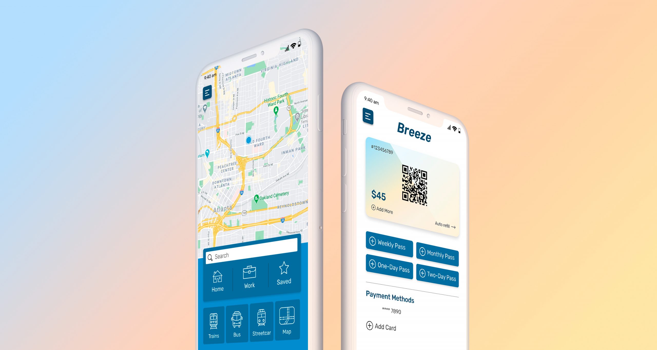
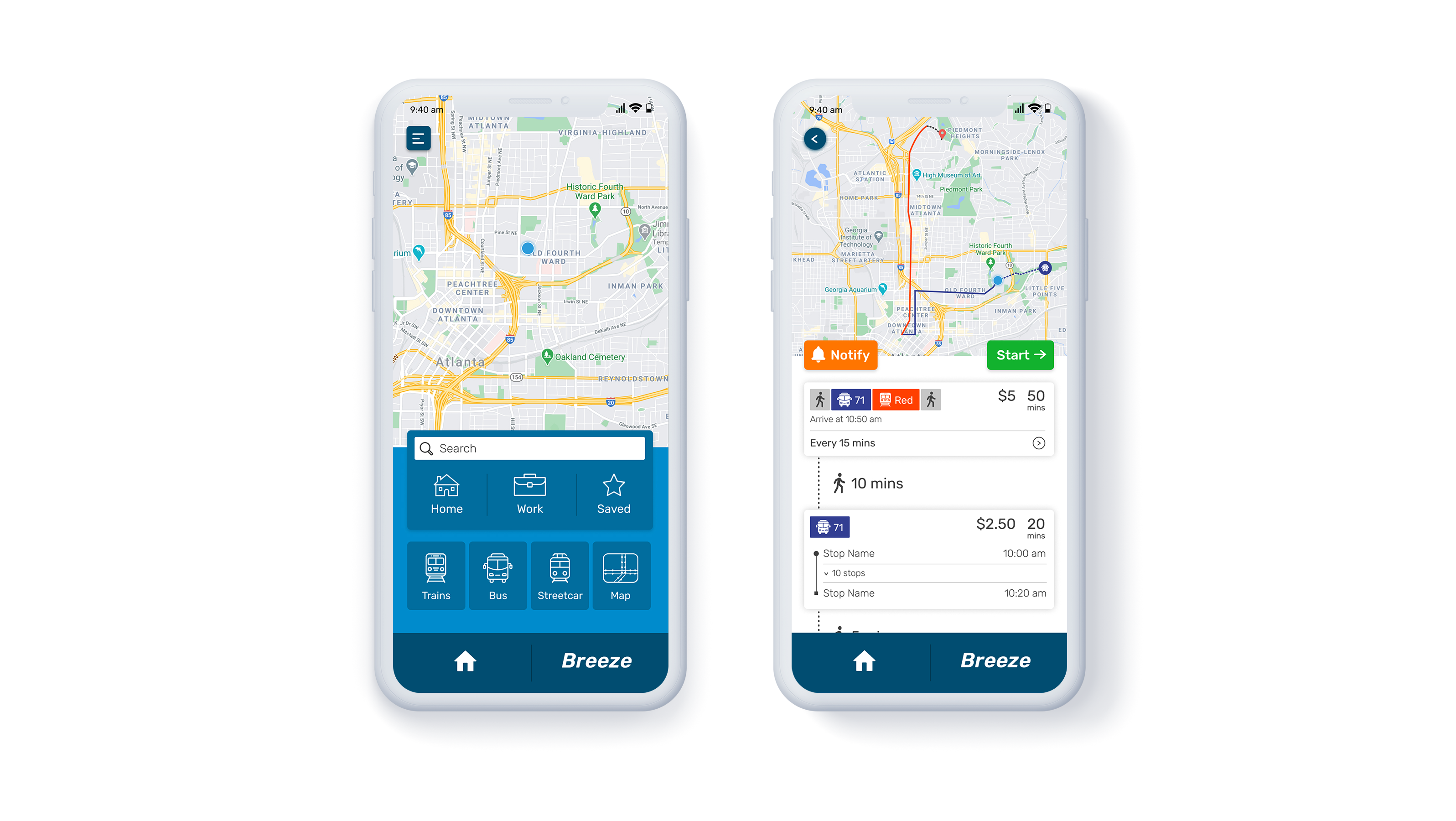
This UX exercise was my personal reimagining of how the MARTA app could work. At the moment, the app would benefit from major improvements and serve as a fully functional navigation app using public transport.
YEAR
2020
ROLE
UX/UI
THE PROBLEM
With the current MARTA app in existence, it has some useful features but the execution of the design is something left to be desired. The links to schedules are not intuitive and at times can seem repetitive. The schedules themselves are set up in a way that are not conducive to mobile viewing. Although there is a navigation feature in the app it is non-functional. A route planning and saving feature along with live tracking capabilities and push notifications would truly make this an effective navigation app specifically for public transport.
THE SOLUTION
Since people rely mostly on visual cues, it would help immensely to see their point of location from where they want to navigate. Having a functioning map would be the ideal solve for this problem. In addition to mapping out a route, it would also help users to visualize the train and streetcar lines, and bus routes. Saving frequented routes, live tracking journeys, and receiving push notifications or alerts would make for the ideal user experience. In addition to all of these features, having the ability to purchase or add a digital Breeze Card would maximize the full potential of the app.
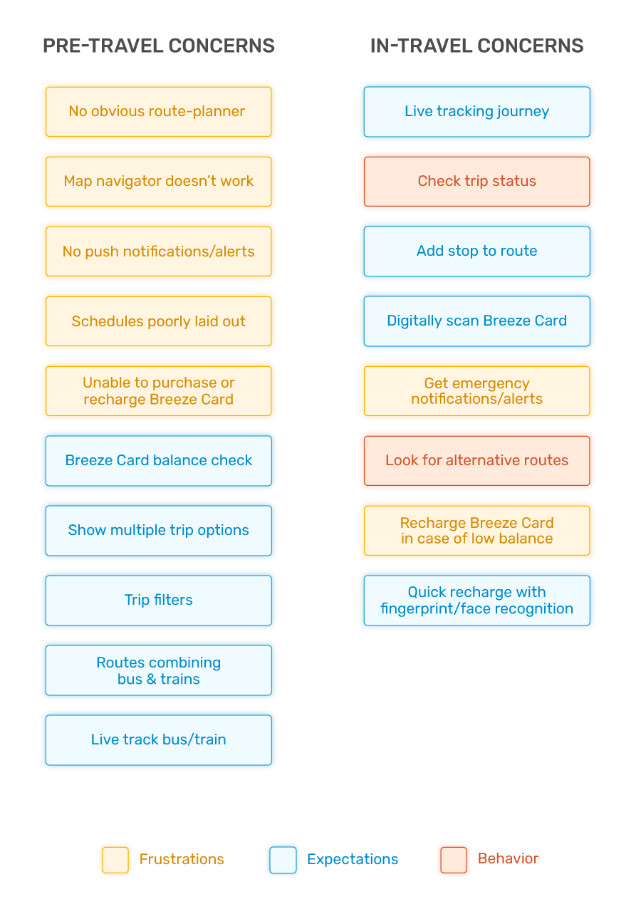
Affinity Diagram
The affinity diagram helps in mapping out user pain points and design opportunities. The main pain points are centered around navigation, trip-planning, the inability to purchase any Breeze Cards, and the lack of push notifications or alerts. One of the main design opportunities would be to overhaul the mapping and navigation system and make it more visually driven. Redesigning the layout of the schedules by adding filters would make it more user friendly and eliminate frustrations of constantly switching back and forth between screens. Adding a way to see multiple trip options or future trips would also enhance the user experience.
Personas
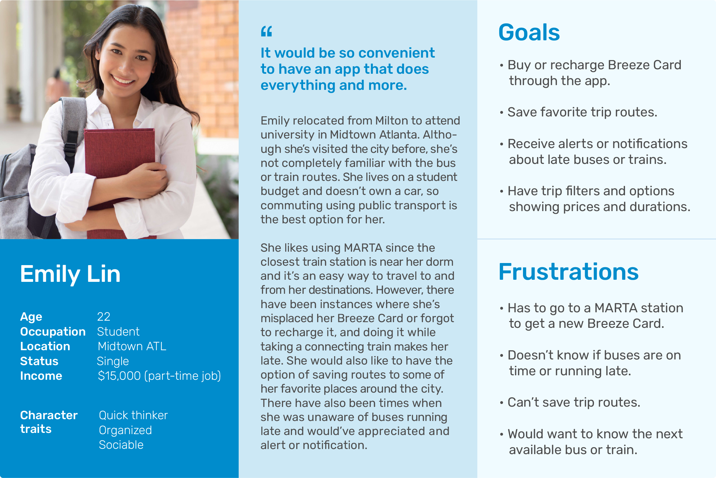
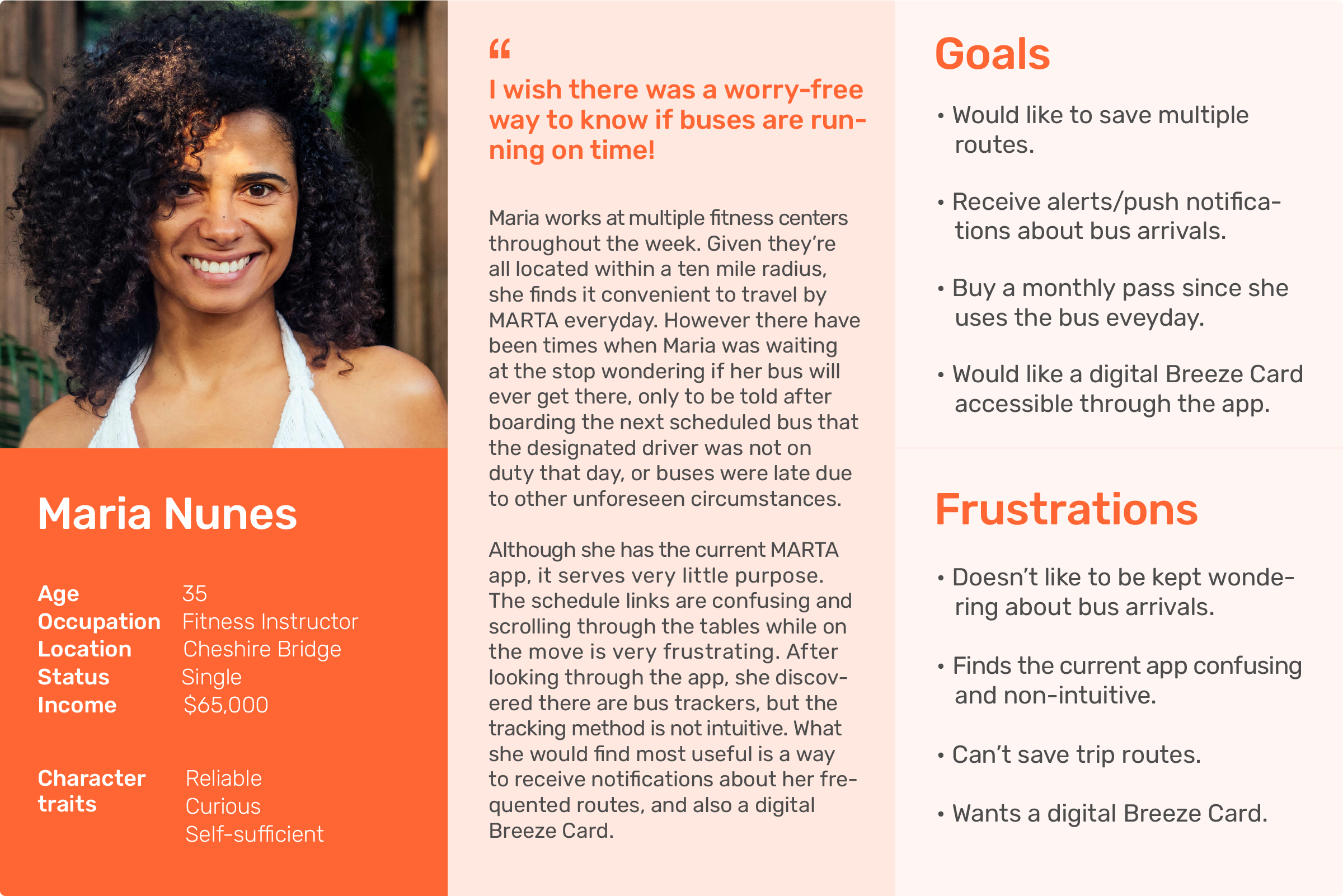
Based on the affinity diagram, personas were generated combining pain points and user expectations. The prospective users of this app would not be limited to any age range. The target audience would be for people who rely on public transport on a daily or regular basis.
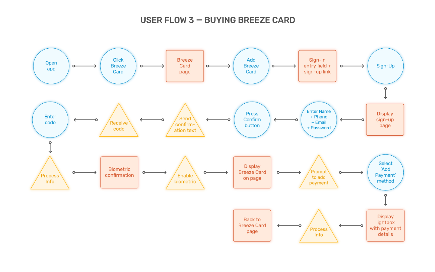
User Flows
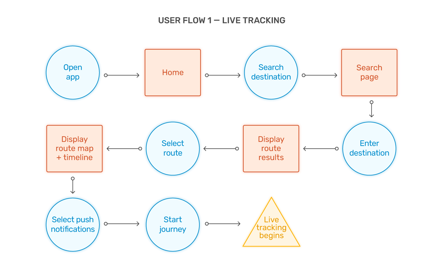
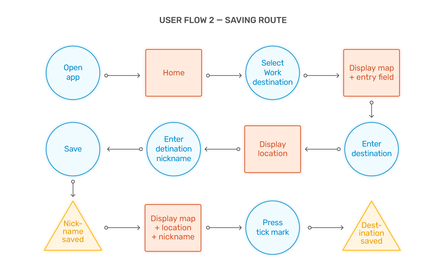
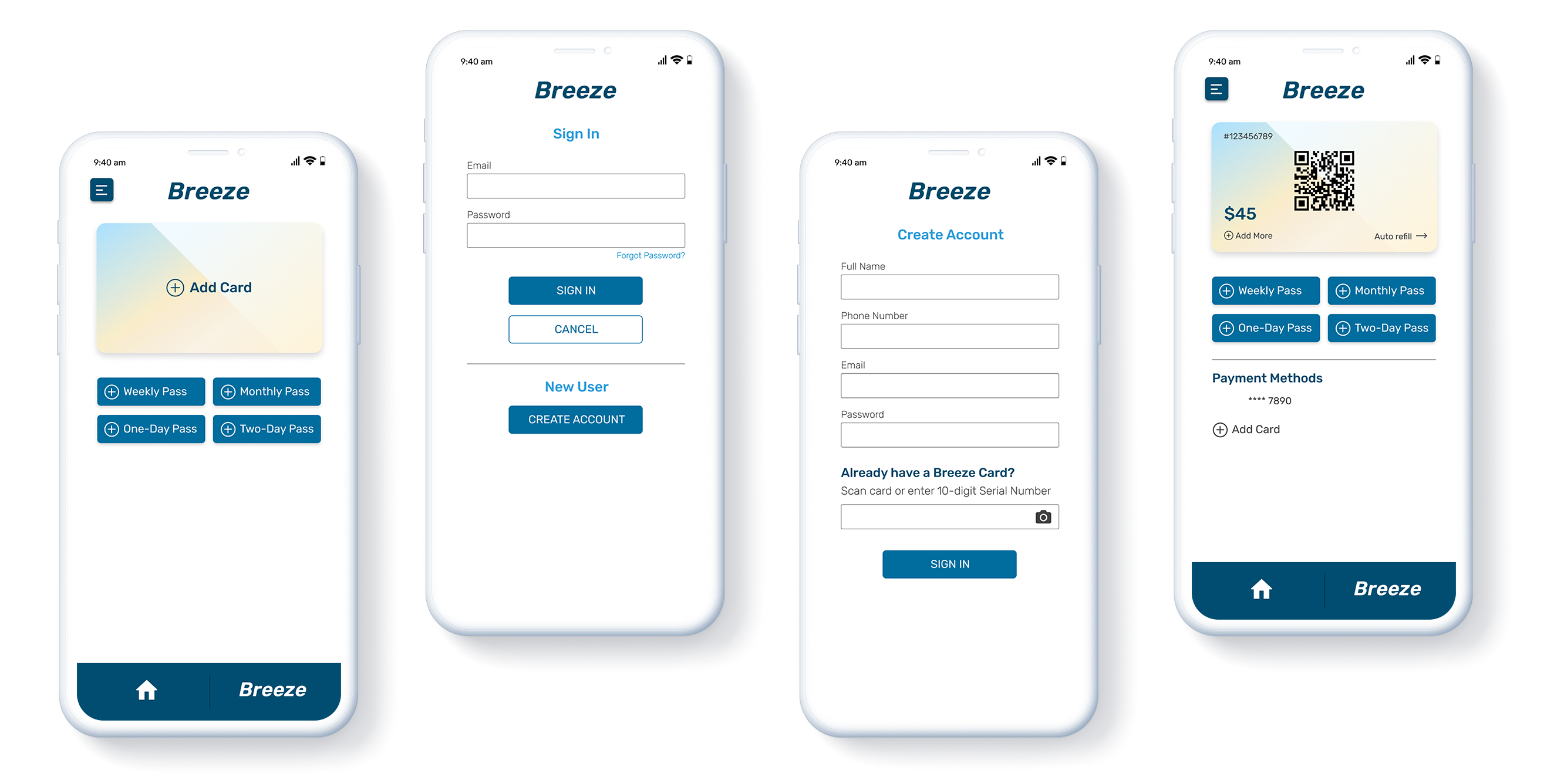
Based on the personas, three main user flows were generated centered mainly around saving frequented routes, live tracking routes, and purchasing a Breeze Card.
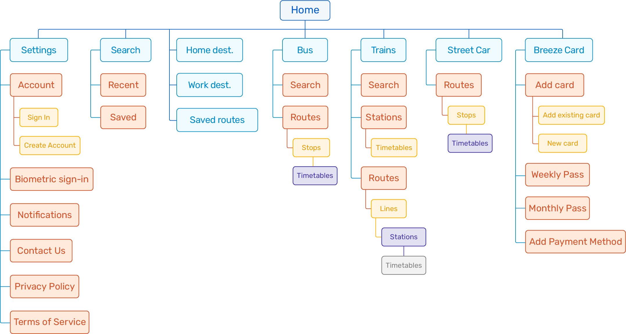
Sitemap
Using the user flows as a guide, this sitemap was generated iterating the structure of the app.
Wireframes
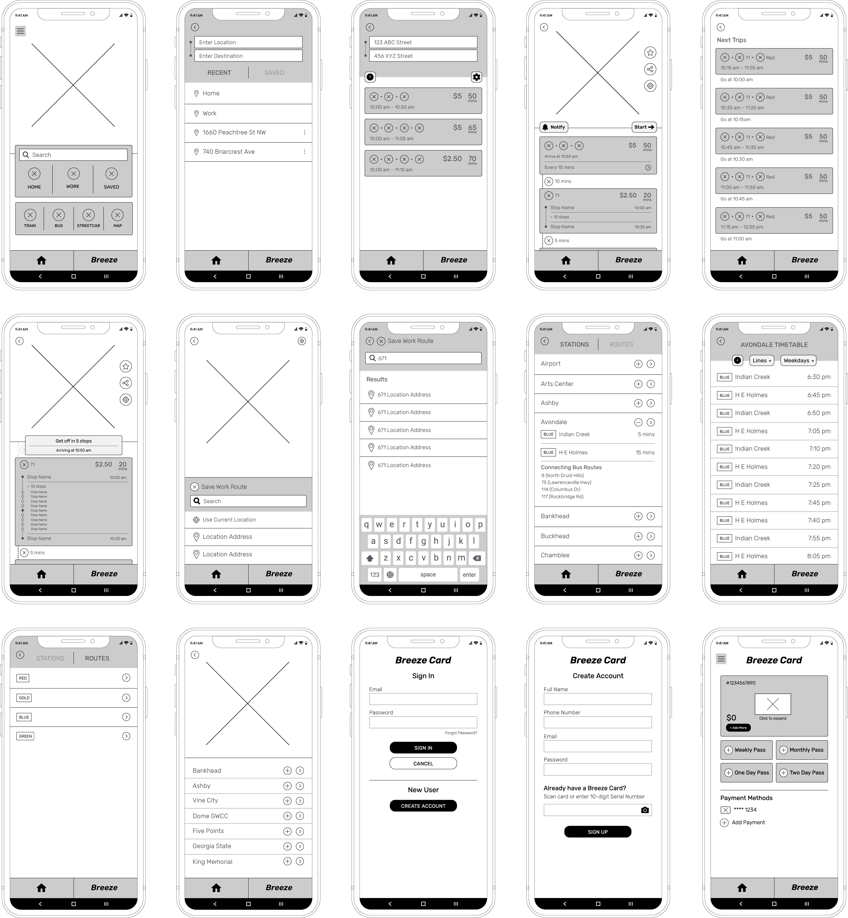
Combining the user flows and the sitemap resulted in visualizing the basic structure and layout of the app, which are the wireframes.
Final Product
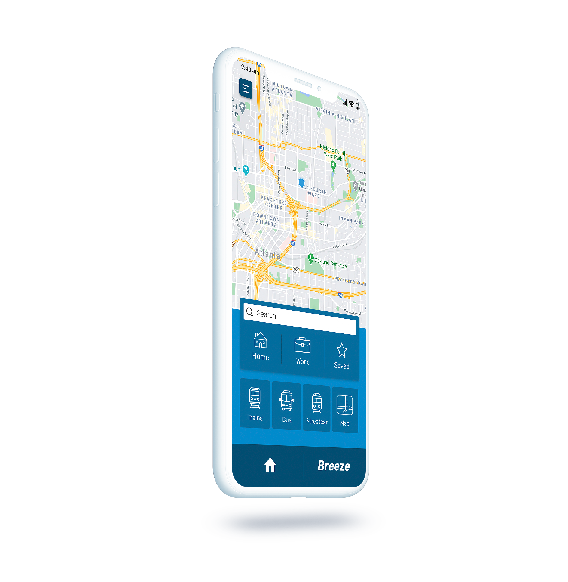
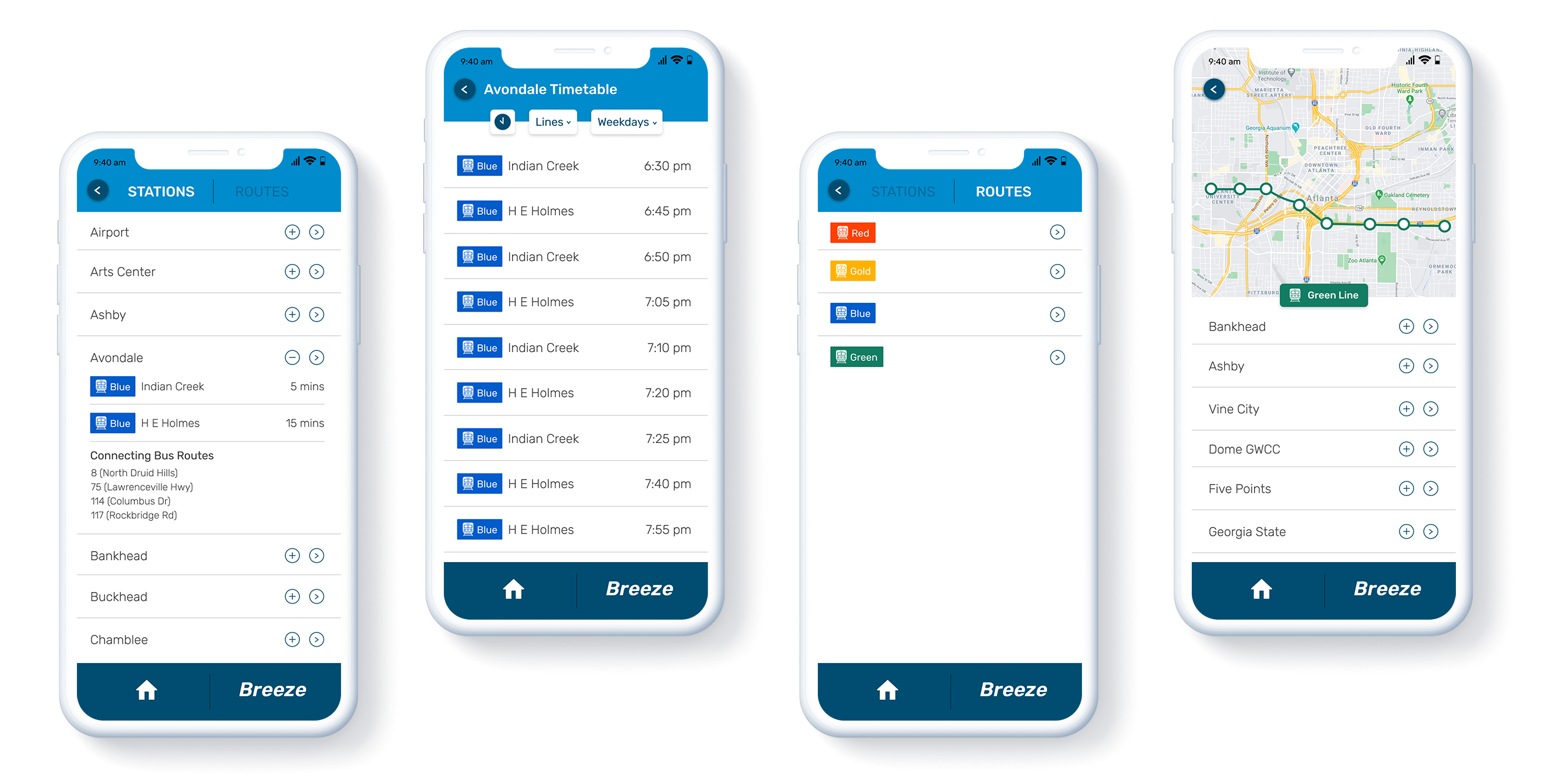
After working on the wireframes, I chose to iterate on some of the specific screens into high-fidelity mockups. Since this is a conceptual visualization of the app, the high-fidelity screens are those which I felt would be most frequented by users.
Route Search and Live Tracking

Stations, Routes, and Timetables
Breeze Card Setup
Components
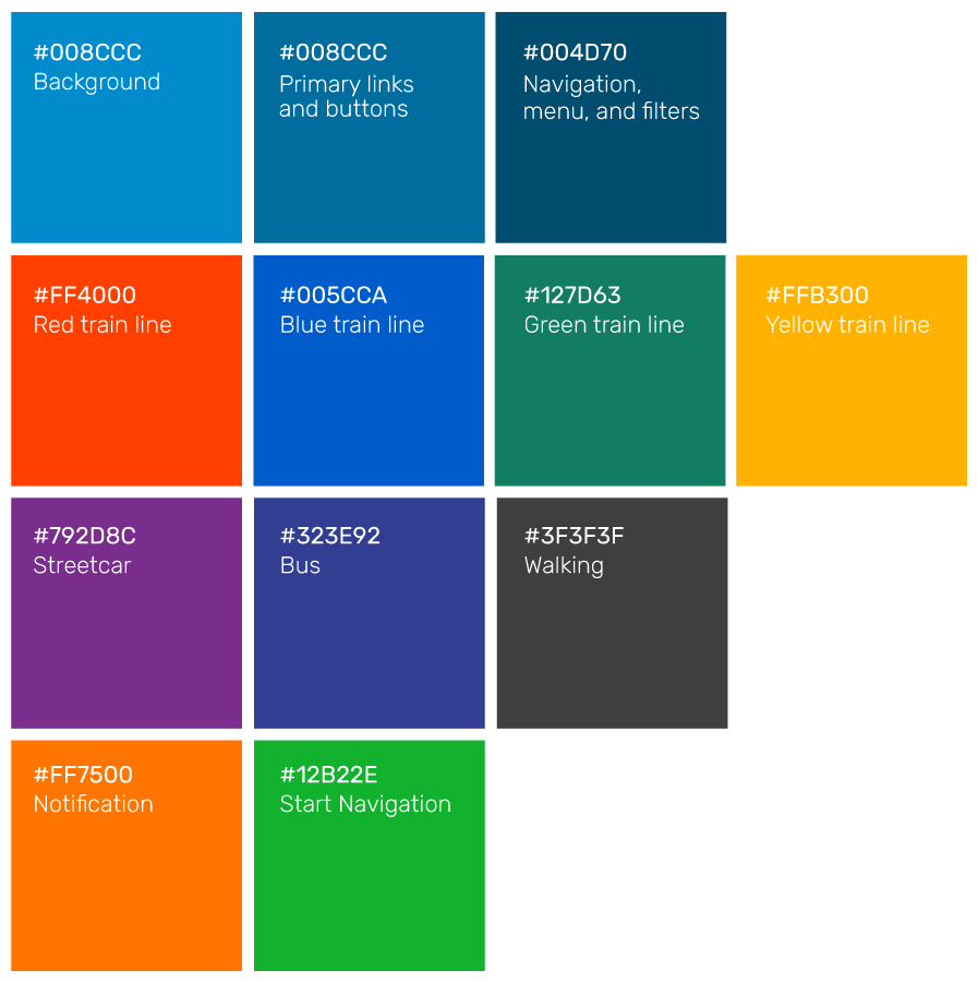
The color schemes and typography were based on MARTA’s brand guidelines. Their official font is Helvetica, but I chose to go with a more contemporary web font sourced from Google Fonts called Rubik which is legible at all sizes. MARTA’s website provides a detailed color palette which is non-existent in its current app. The icons are visual cues for different modes of transportation, navigating ones way around the app, trip filters, and shortcuts to saved destinations.
