This company is a leading beauty distributor in the U.S., providing wholesale professional products from top brands to licensed aestheticians. The project aimed to unify the varied styles of website components, from basics like buttons and color swatches to subtle details like shadow effects and dividers. The solution was to create a consistent set of components and guidelines, ensuring design and development efficiency, scalability, and a more cohesive user experience—ultimately boosting user engagement.
YEAR
2023
ROLE
Senior UX Designer
Product Designer
Interaction Designer
Design System
THE PROBLEM
The company’s website is a key touchpoint for customers and stakeholders, but several challenges have negatively affected both user experience and business performance:
• Design inconsistency across the site, with varying color schemes, typography, and visual elements, created a fragmented and disjointed user experience.
• Inconsistent navigation and user interface issues led to low user retention, with visitors frequently leaving the site early, resulting in reduced engagement and missed conversion opportunities.
THE GOALS
To tackle these challenges, the goal is to create a comprehensive design system that fosters consistency, boosts user engagement, and enhances the overall user experience.
• By developing a design system that incorporates a unified color palette, typography, iconography, and a component library, we can ensure that all UI elements are consistent across the website. This cohesive visual identity will reflect the company’s brand values and quality, thereby building trust with users.
• Additionally, designing a user-centric experience that is intuitive and facilitates a seamless navigation journey will significantly enhance user satisfaction and encourage repeat visits.
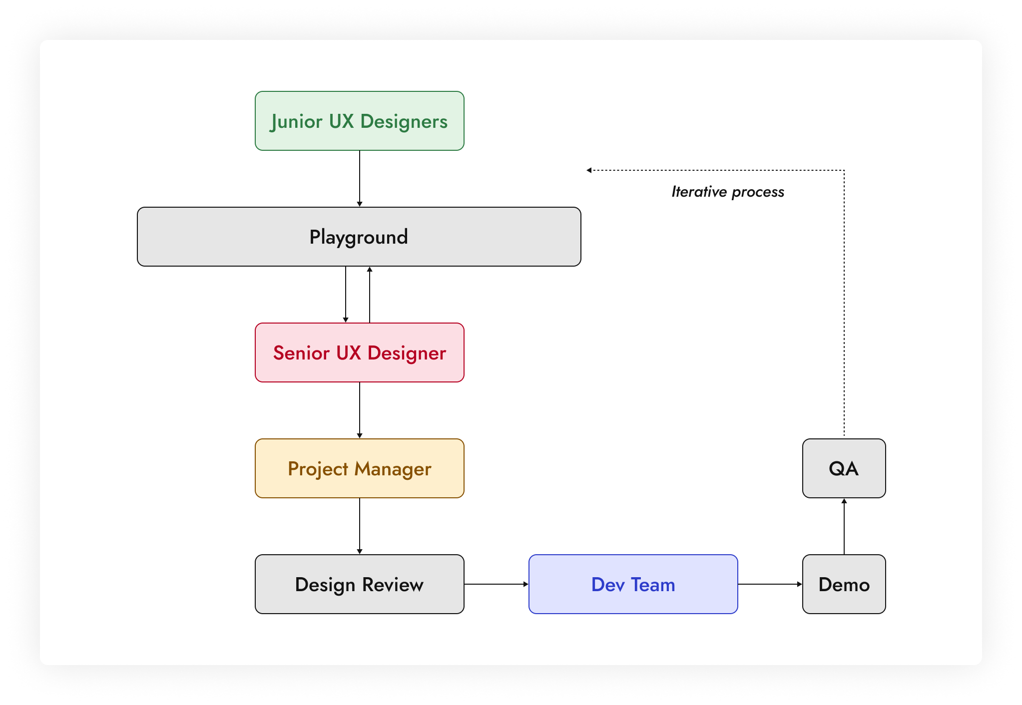
Design Process
The team consisted of four junior designers, one senior designer, and a UX manager. The junior designers conducted the initial UI evaluations, collecting component instances from the website and documenting similarities and irregularities in a Figma playground. They then created the atoms.
As the senior designer, I developed the molecules, organisms, templates, and pages. After each component build, I collaborated with the UX manager to refine behaviors, variants, and responsive qualities before passing them to the developers.
Additionally, I mentored the junior designers, illustrating how atoms form larger components and emphasizing the importance of auto-layout for responsive designs in Figma.

Atoms
Since this design system was built before Figma introduced the concept of tokens, we considered atoms to be the smallest starting point. They represent elemental UI elements such as color, typography, icons, spacing, grids, and images for thumbnails. They serve as the foundation upon which more complex components and interfaces are built.
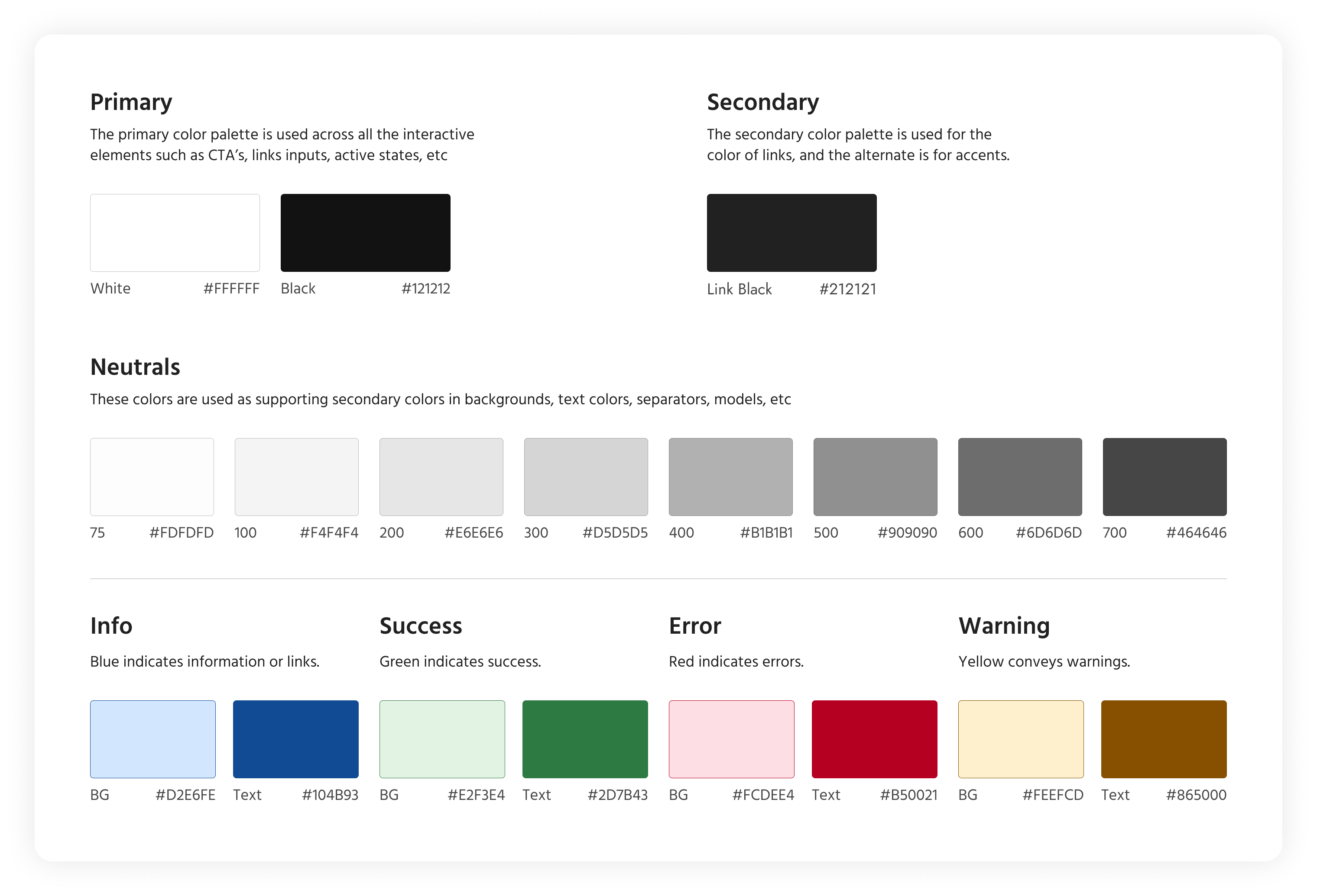
01. Colors
In a design system, colors are essential for visual consistency, brand identity, and enhancing user experience across digital products. For this company, the primary color scheme features white, black, and grey shades. All color combinations used in components were tested for accessibility, meeting at least AA standards, and often AAA.
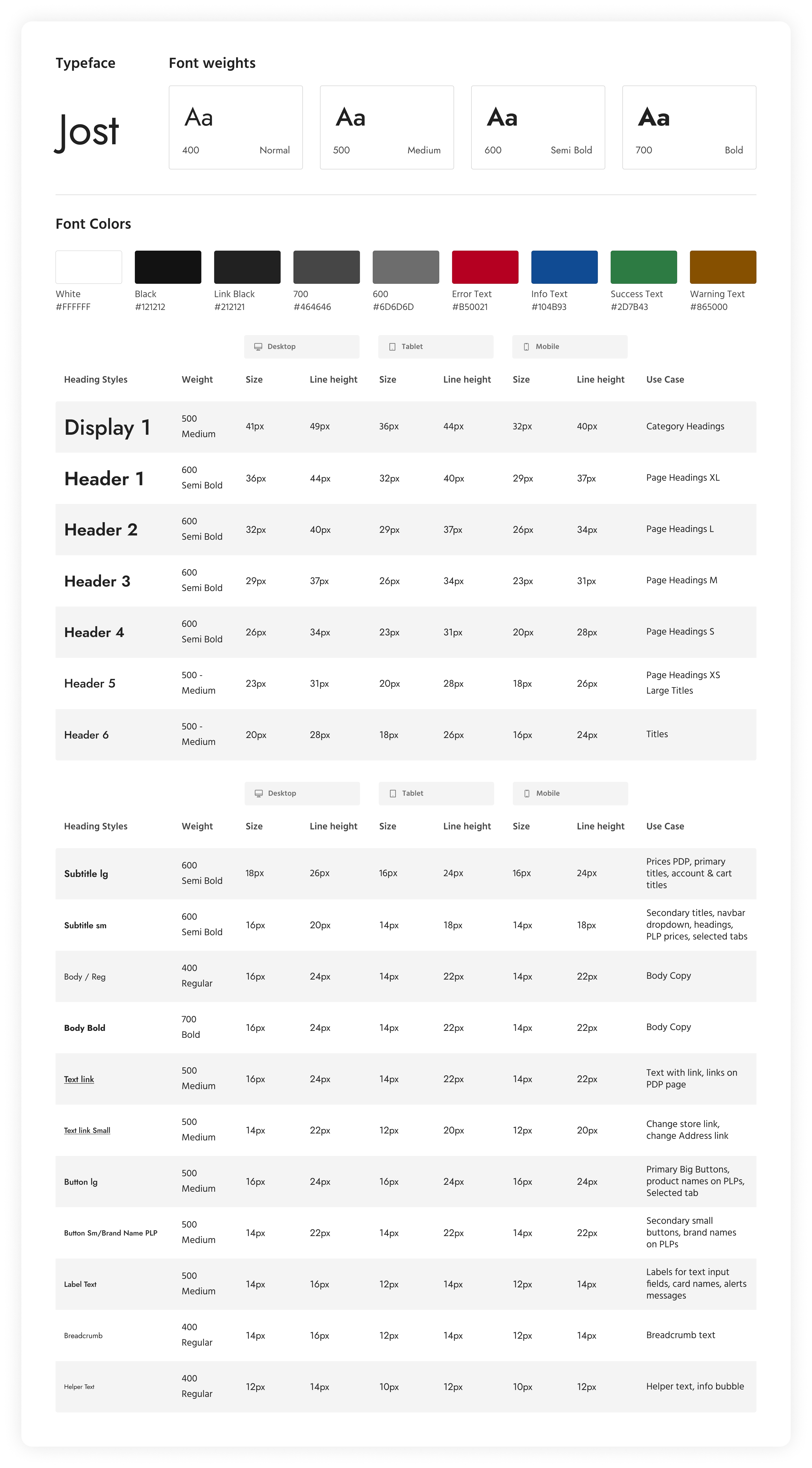
02. Typography
The Jost font family is used in this design system. The chart below breaks down the different sizes for headings, subheadings, body text, links, buttons, and more for desktop, tablet, and mobile platforms.
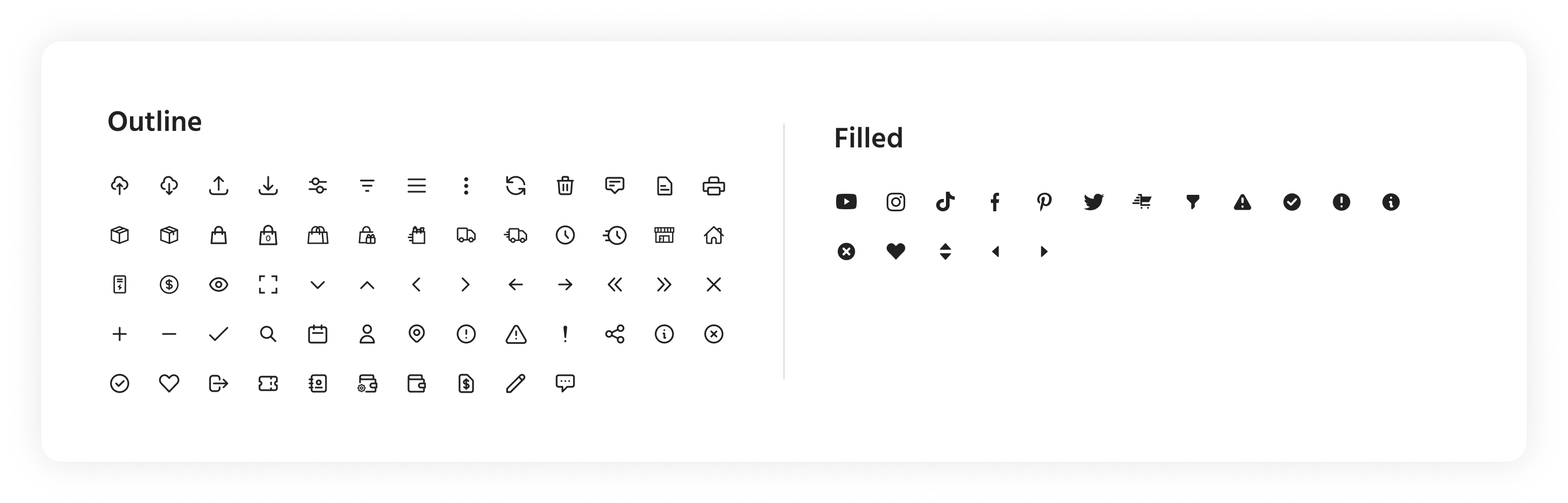
03. Iconography
This design system mostly uses line icons with the rare exception of filled icons within some components.
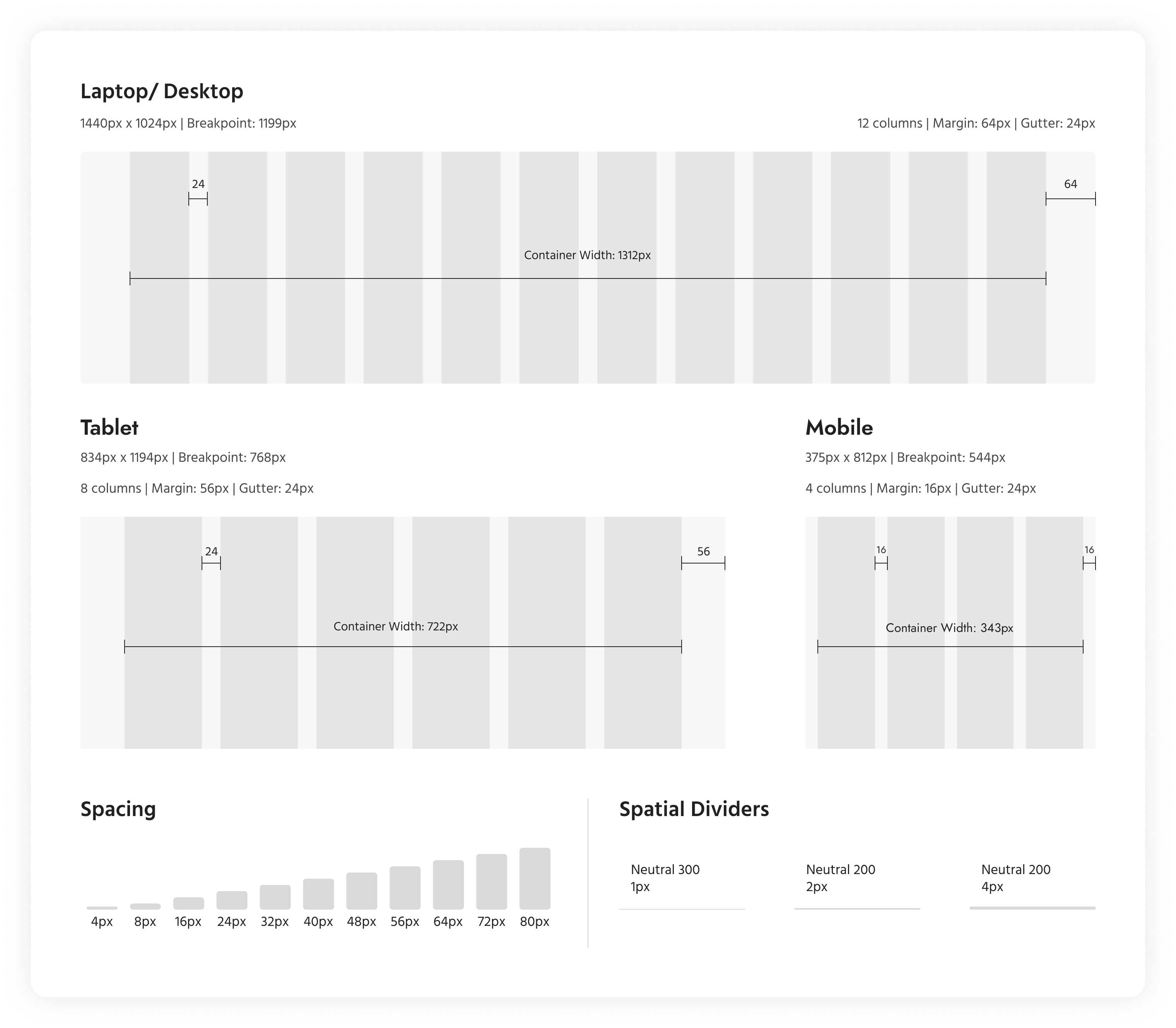
04. Grids & Spacing
The image below provides the breakpoints for all the platforms and also details the margins, column widths, and gutter space for each platform. Spacing refers to the consistent use of margins, padding, and other spatial relationships between elements to create visual harmony, improve readability, and enhance user experience. The spacing uses multiples of 8 with the smallest unit being 4px.
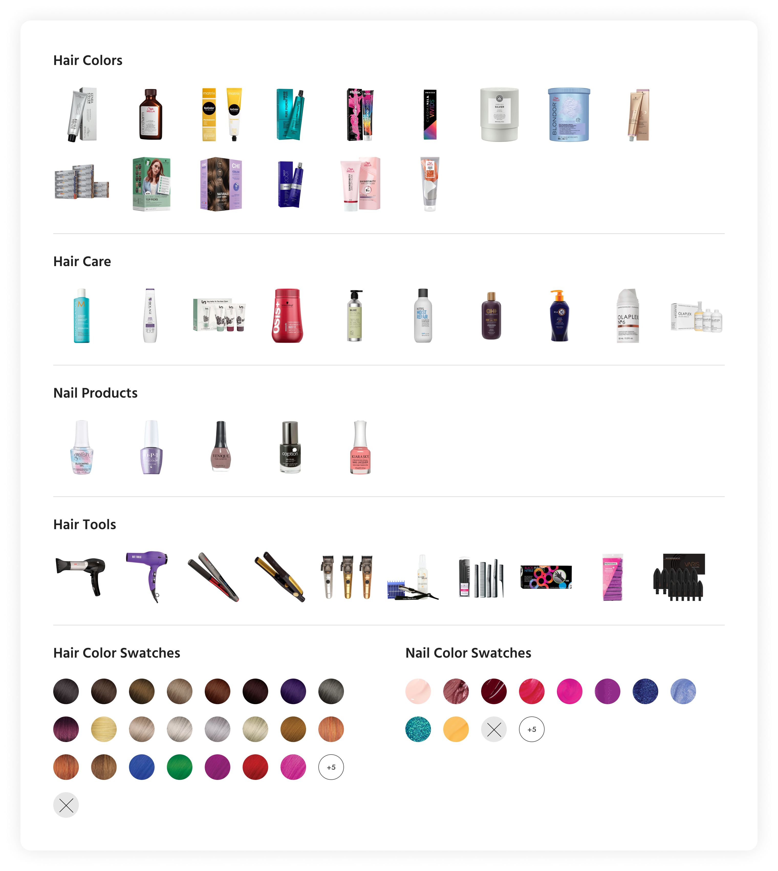
05. Images & Swatches
Given this is a beauty supplier company, images and color swatches play an integral role in the design system as placeholder images are requisite in creating mockups and prototypes. Four main categories were created comprising of at least 5 to 15 images and color swatches.
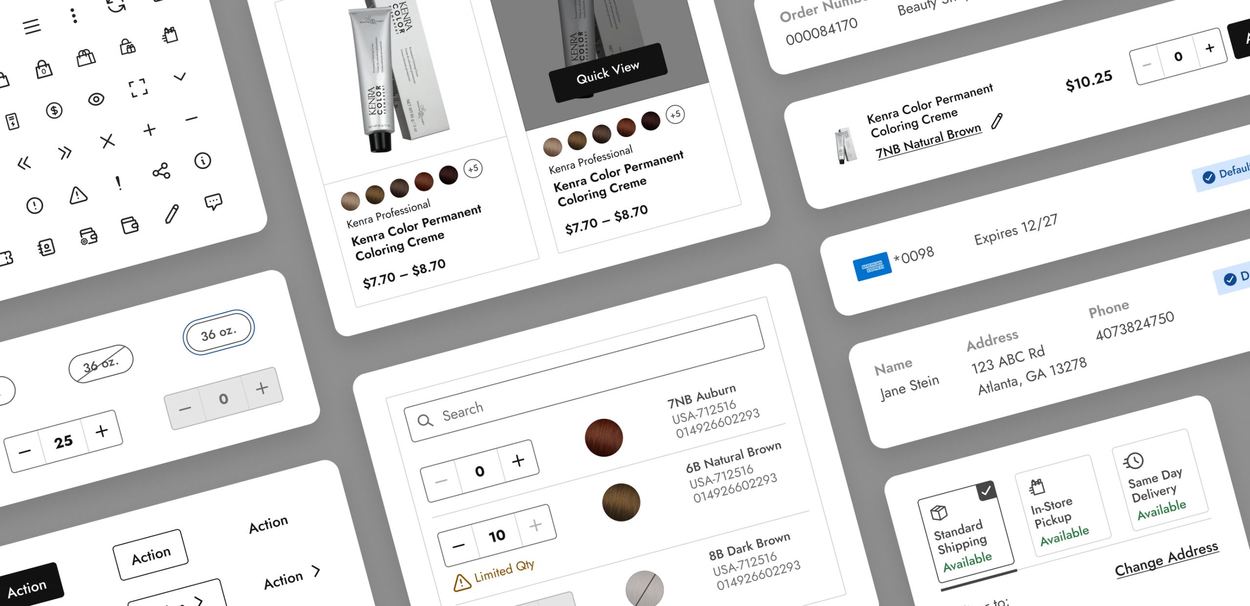
Molecules
These molecules were created by combining atoms — colors, typography, and icons — in different configurations, and they represent common patterns or functional units within a UI, such as buttons, form inputs, badges, notifications, and more.
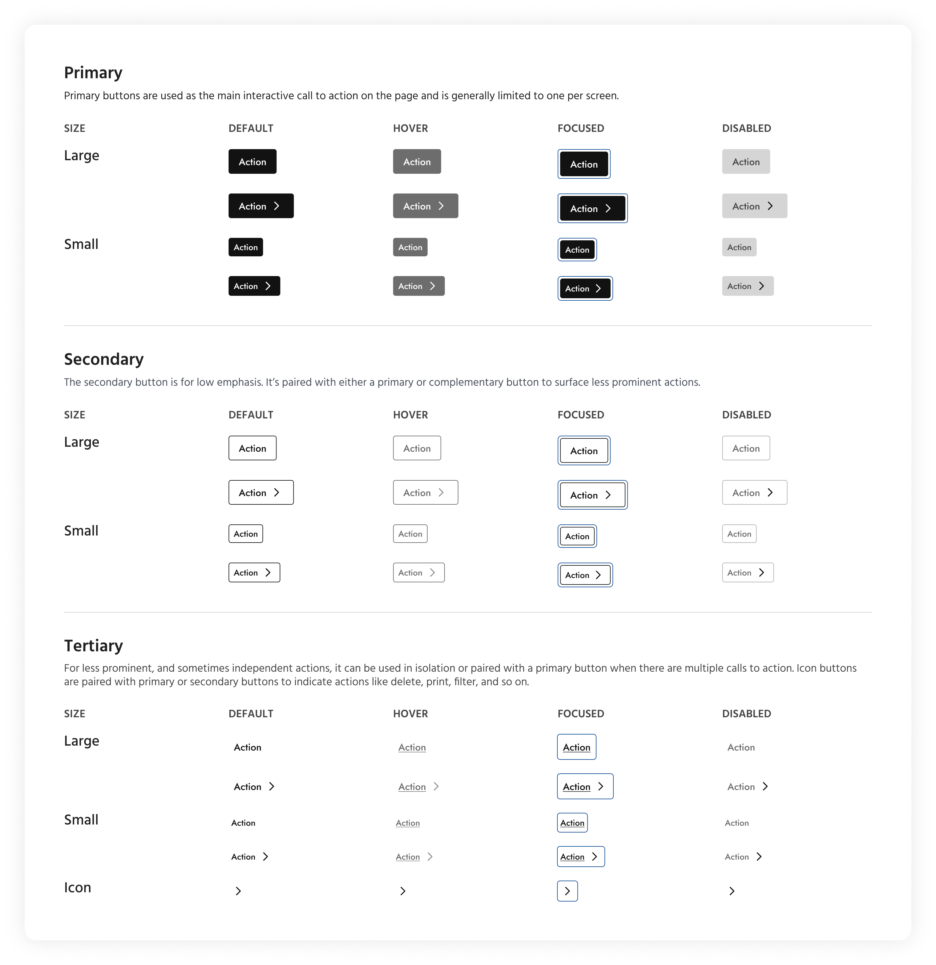
01. Buttons
The set of buttons shown below are divided into three groups — primary, secondary, and tertiary — and are sized in big and small variants. The chart illustrates the various states of the buttons.
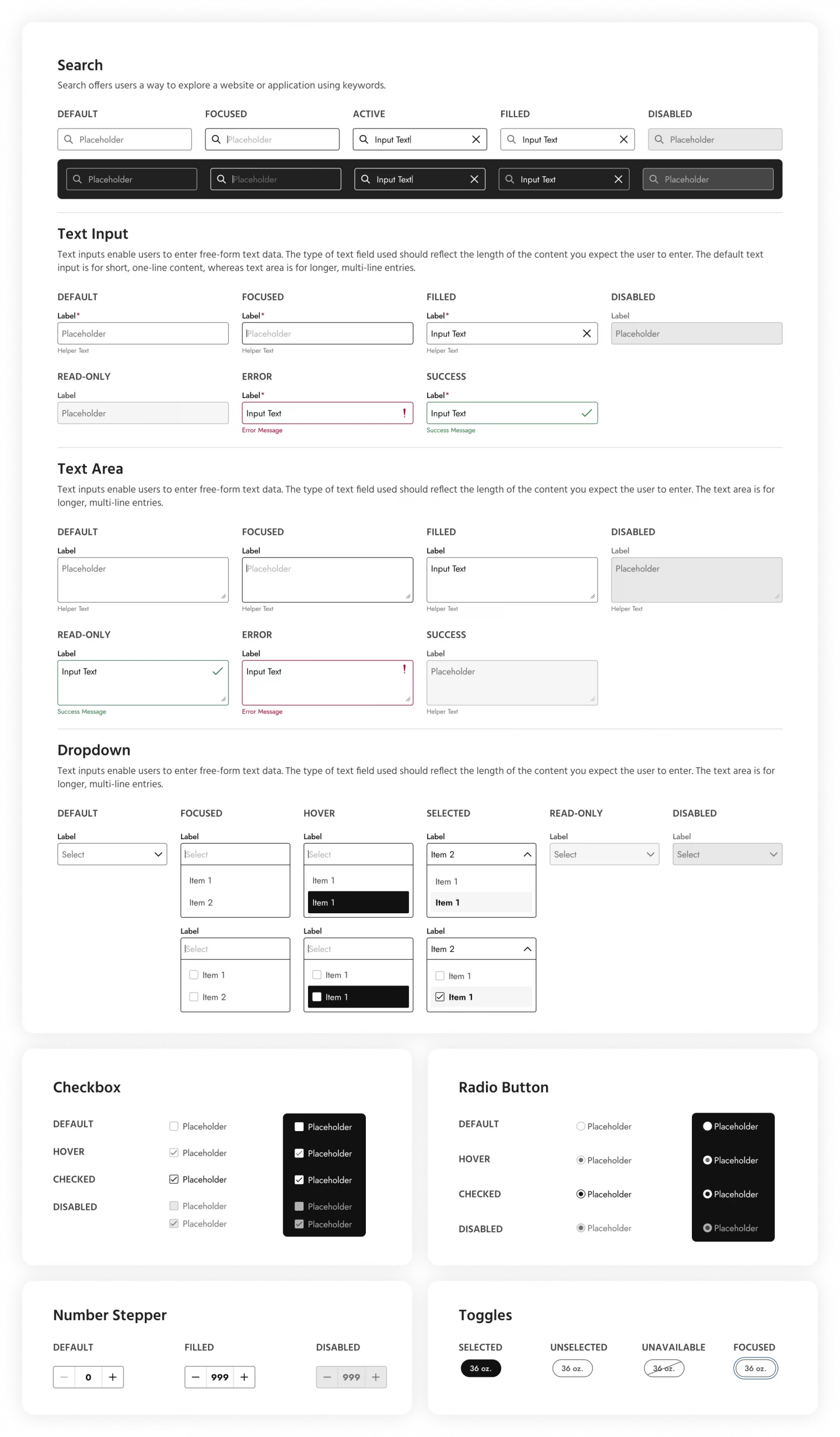
02. Inputs
Form inputs are essential elements of user interfaces that allow users to provide data or interact with a system. In this case, they are categorized as:
- Text inputs: Single-line or multiline text fields where users can input text data.
- Select dropdowns: Dropdown menus that present a list of options for users to choose from.
- Checkboxes: Switches that allow users to select one or more options from a list.
- Radio buttons: Single-choice buttons that allow users to select one option from a list.
- Number Stepper: Allows users to select a quantity.
- Toggles: Options to select a particular size or amount of a product.
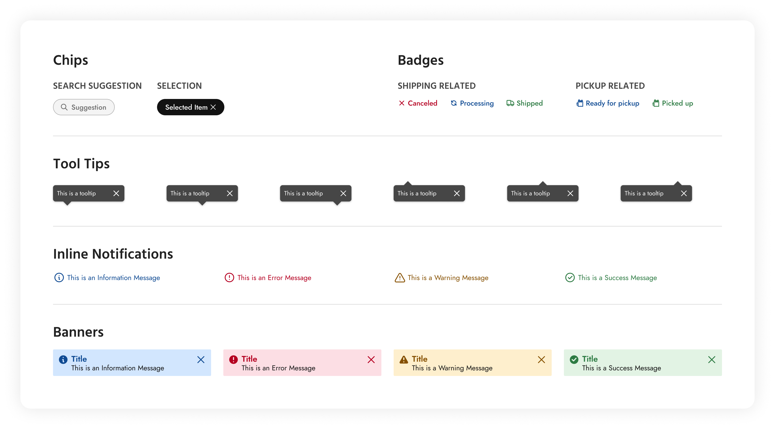
03. Chips, Badges, Notifications
In this section, chips, badges, tooltips, and notifications have been clubbed together because they share several common characteristics and purposes, despite serving different functions within the user interface. These are all visual elements that provide additional information or feedback to users within the interface which are typically small, non-intrusive components that augment the user experience without dominating the screen. Each of these components serves to provide contextual information or feedback related to specific elements or actions within the UI.
Organisms
Organisms represent relatively complex UI components that are composed of groups of molecules and/or other organisms. Organisms encapsulate larger sections or functional units within a user interface and often serve as building blocks for entire sections or pages.
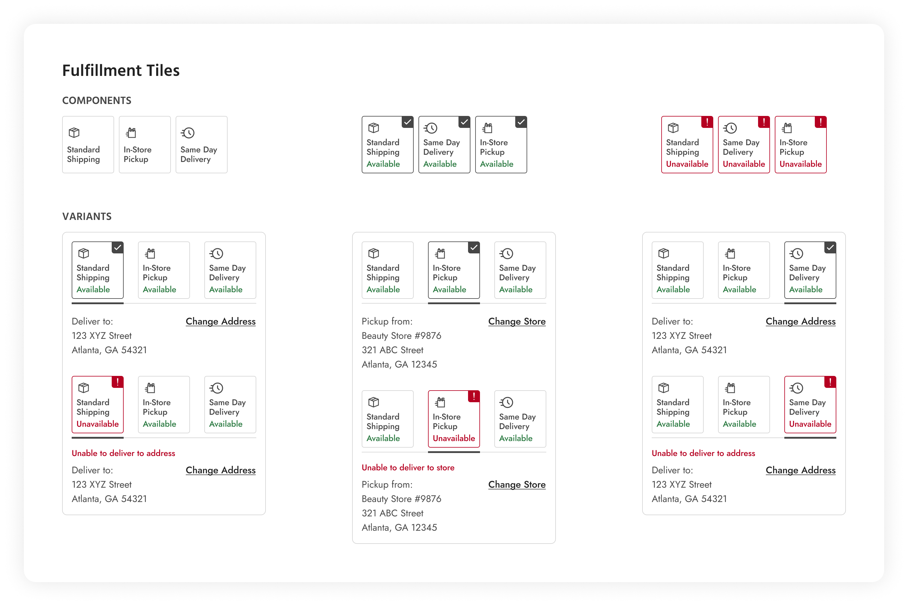
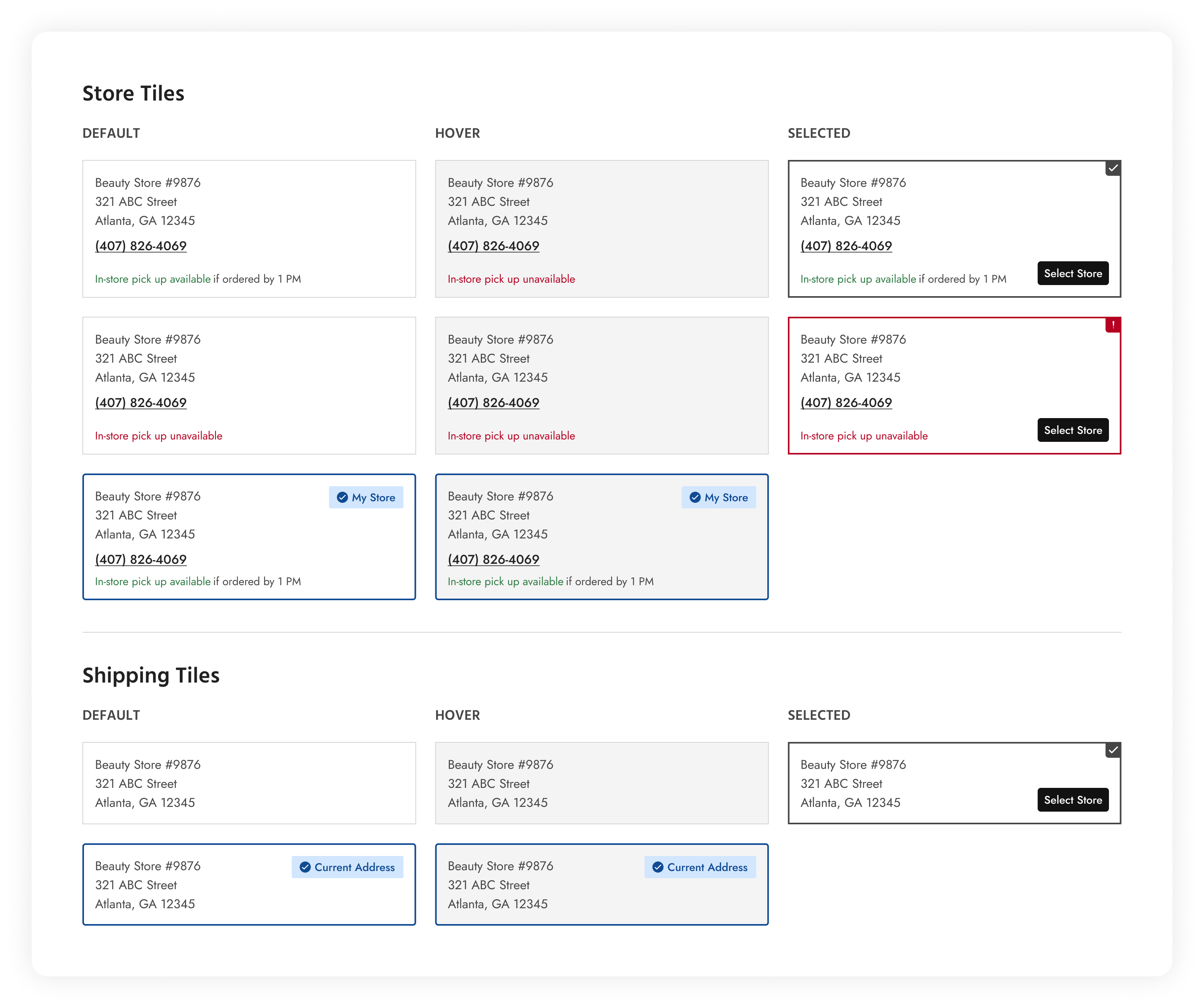
01. Tiles
Fulfillment and shipping/store tiles are organisms representing complex UI components that provide information and functionality related to order fulfillment processes. These tiles serve as visual summaries or containers for displaying key details and actions.
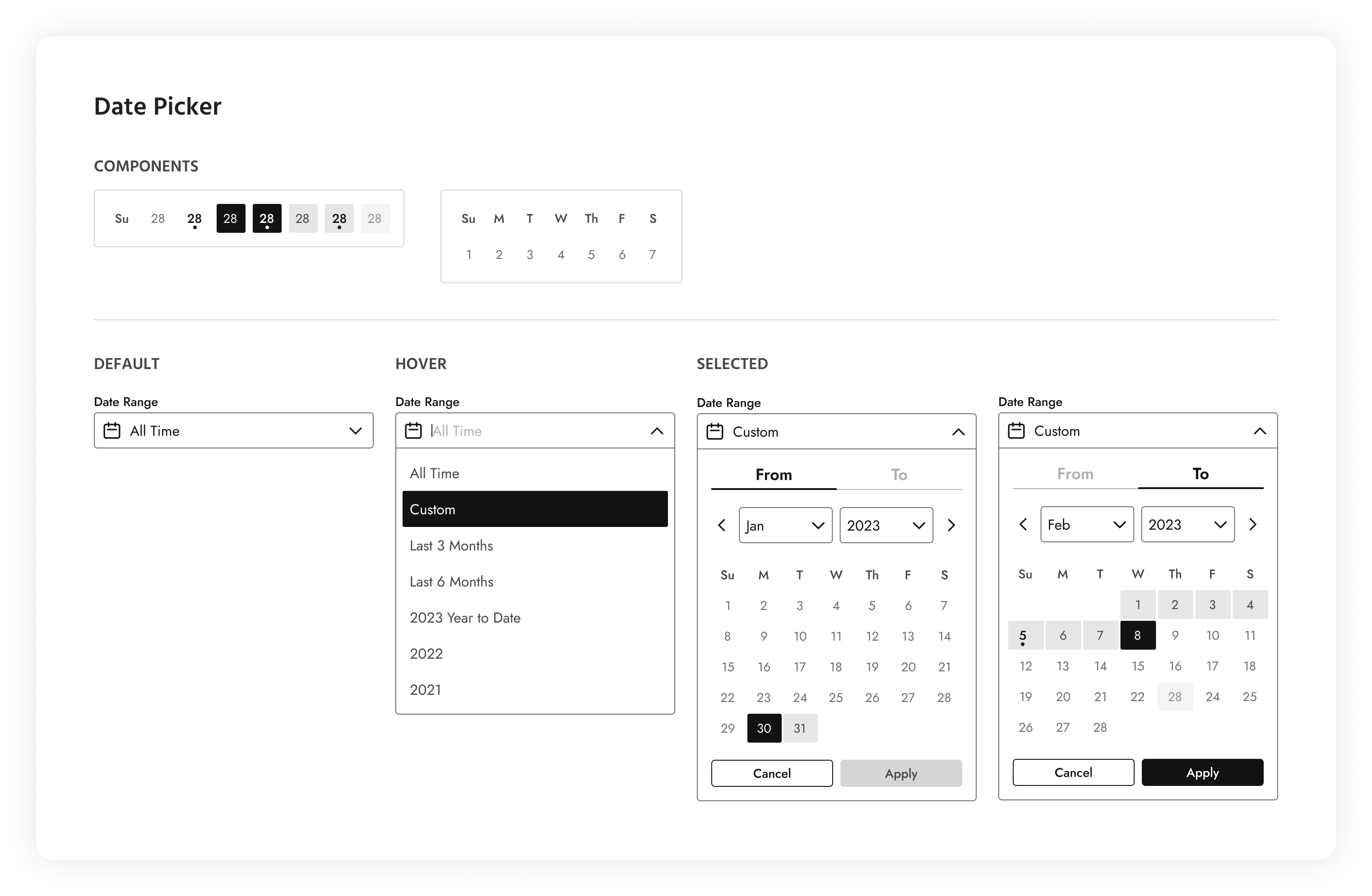
02. Date Picker
This date picker allows users to select dates from a calendar or input field. It provides a visual interface for users to choose a general period or a custom date range displayed as a dropdown menu.
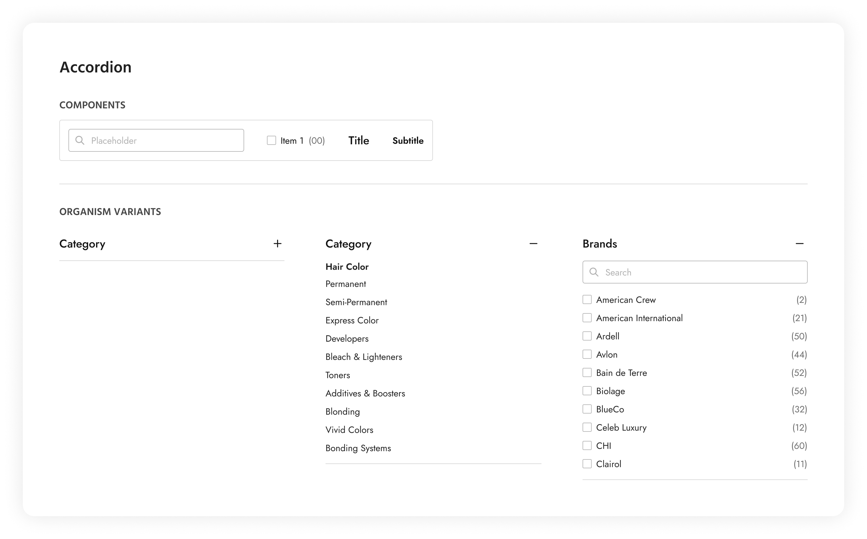
03. Accordion
The accordion in this design system allows users to toggle the visibility of content sections. It consists of collapsible panels, with each panel containing a header, a subtitle, a body, a search bar, and a list of options. The user has the option of toggling the visibility of all the elements, with the exception of the header. This is typically displayed on a PLP page. This accordion can also be used as a substitute for tabs on smaller devices displaying detailed information that is contained in each panel.
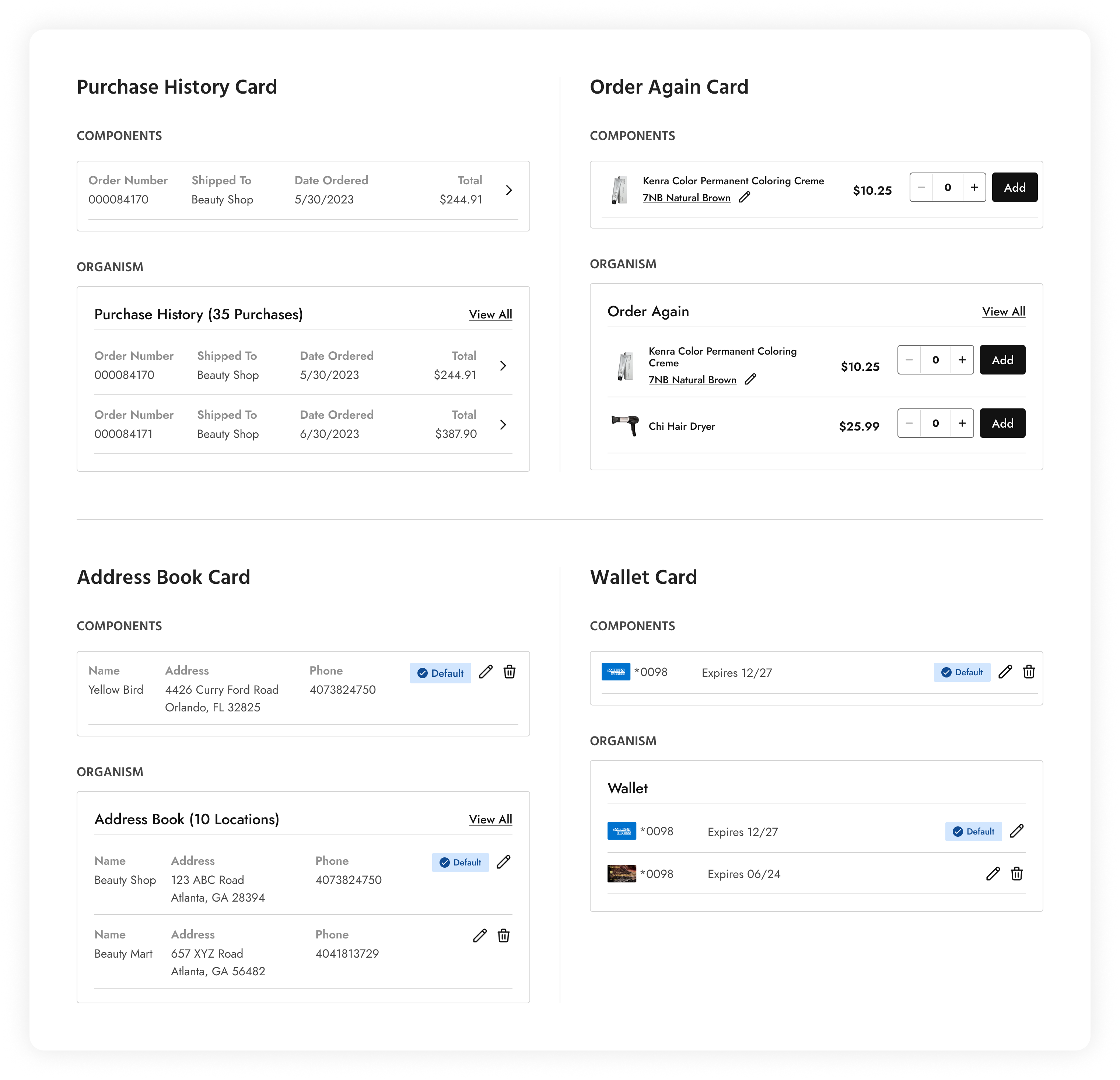
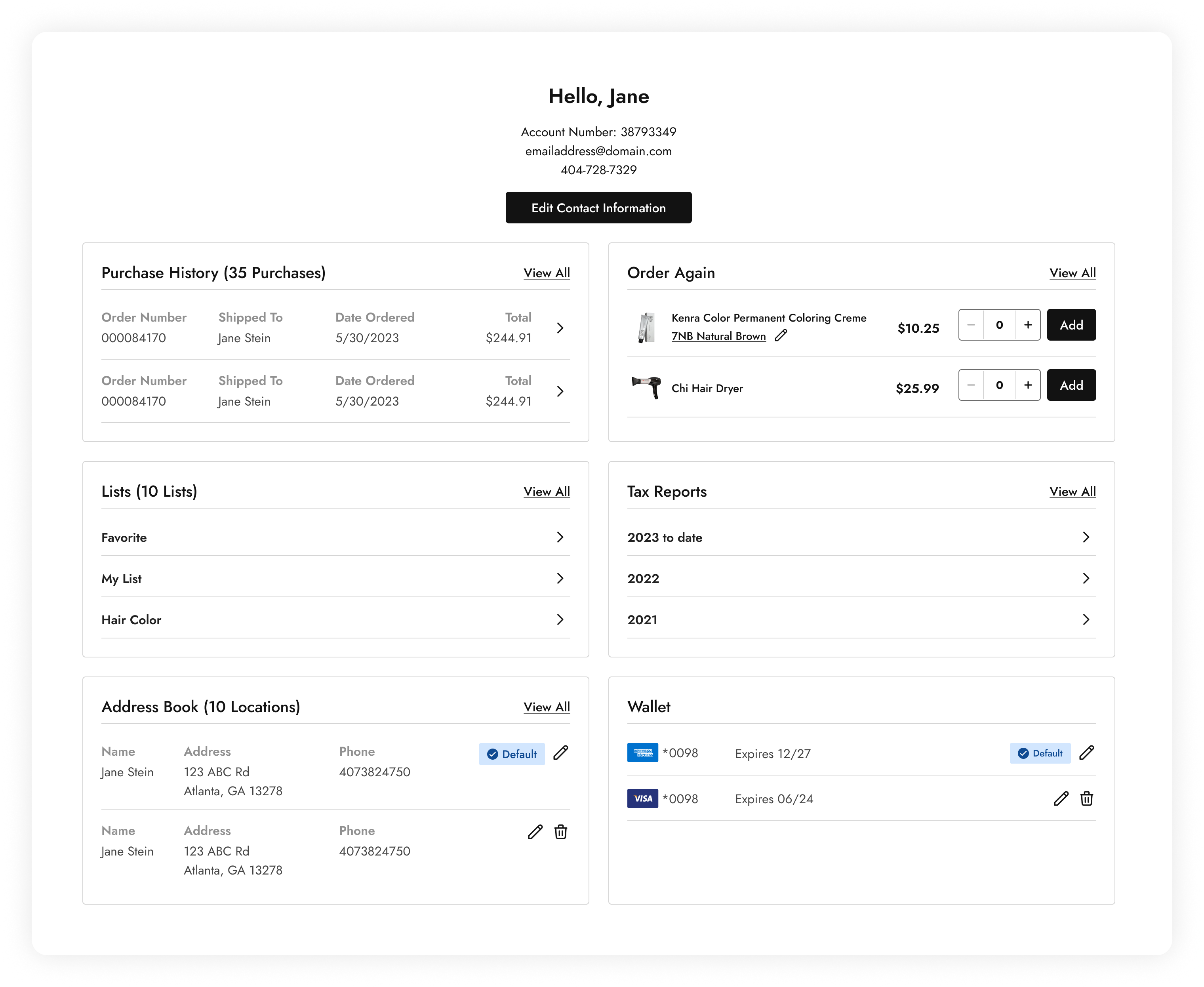
04. ‘My Account’ Cards
‘My Account’ cards, as the name suggests, are components that go into building the ‘My Account’ page. These provide users access to their purchase history, their ordering habits, address and payment settings.
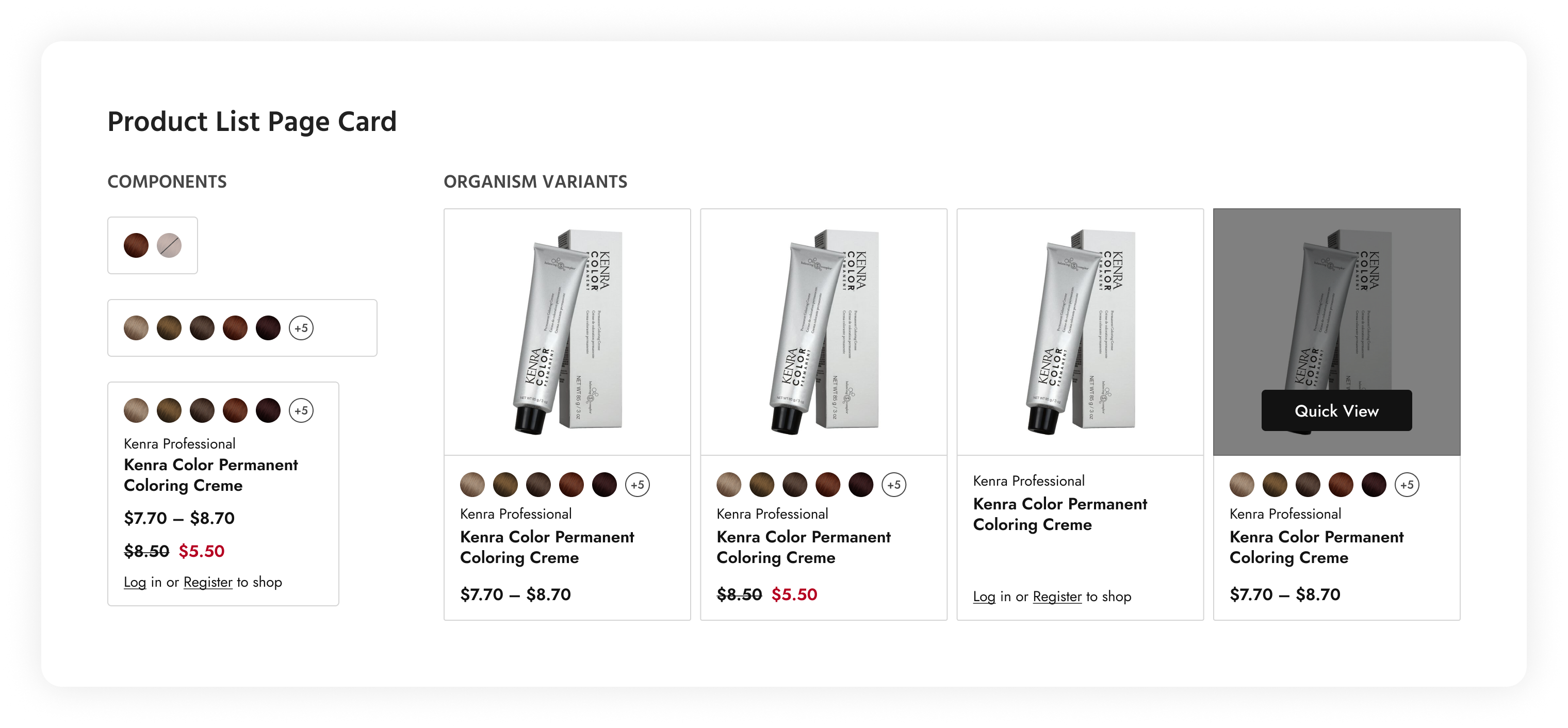
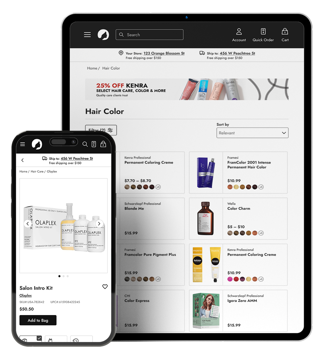
05. PLP Cards
PLP cards provide key information about each product in an easily scannable manner. These components include essential details about the product, such as the product name, price, image, color swatches, and availability status. Displaying this information prominently allows users to quickly evaluate each product without having to click into individual product pages.
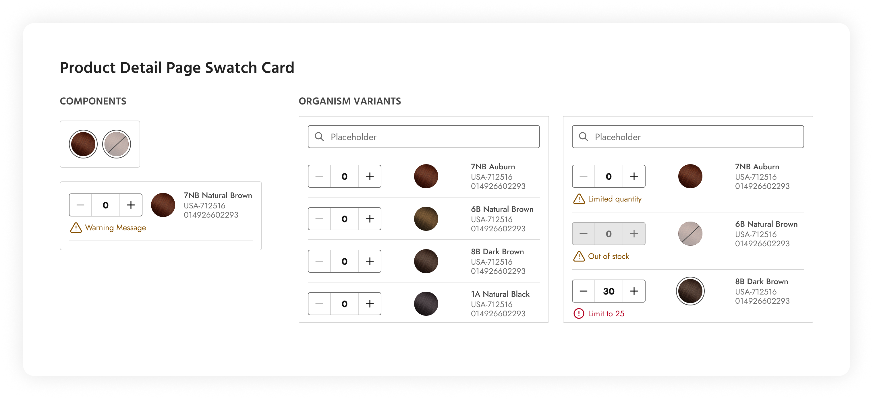
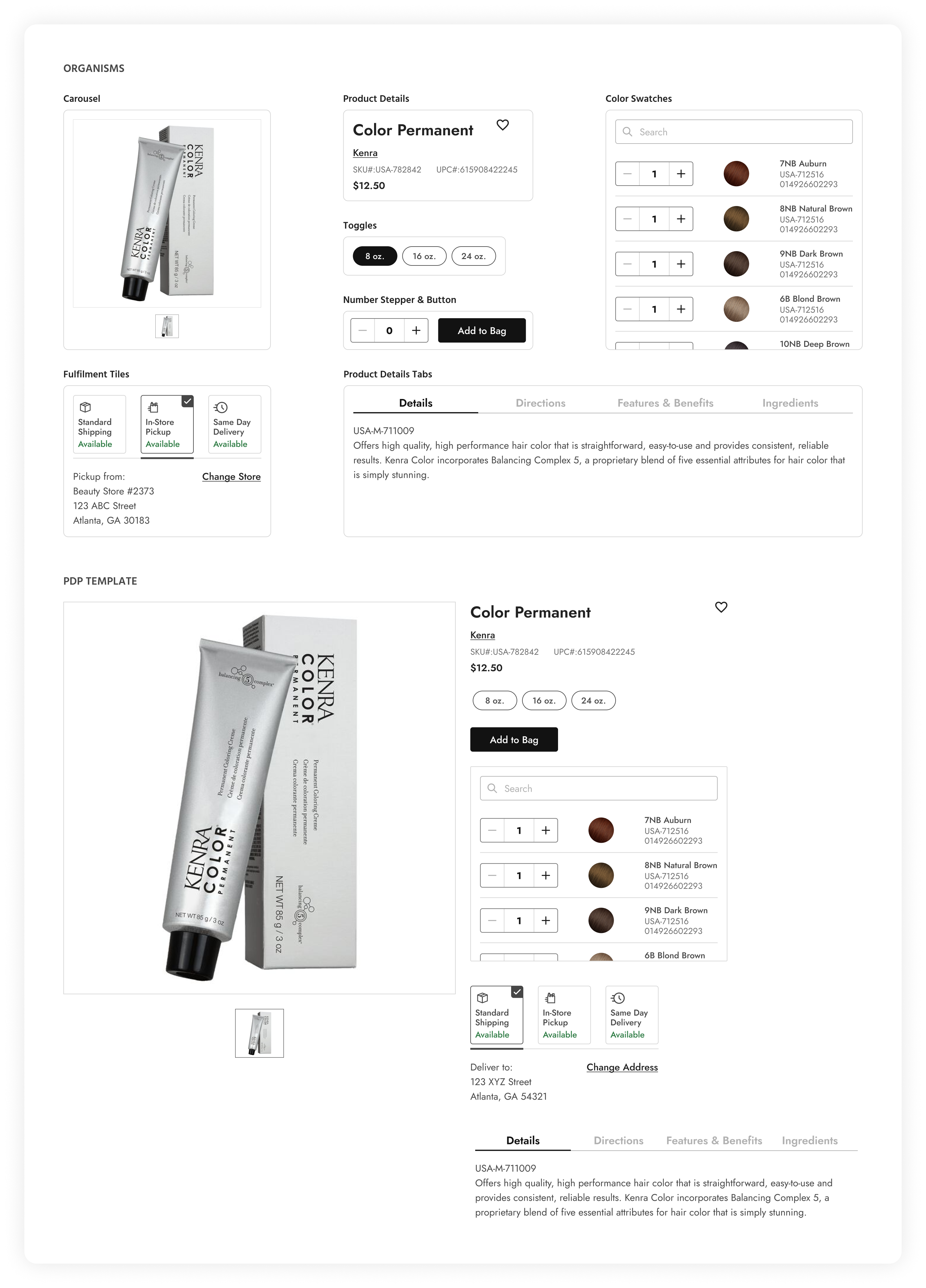
06. PDP Swatch Cards
A PDP swatch card is a UI component commonly used in e-commerce websites and applications to display product variations and options, typically in the form of color swatches. Swatch cards provide users with a visual representation of different product options and allow them to select their preferred variant.
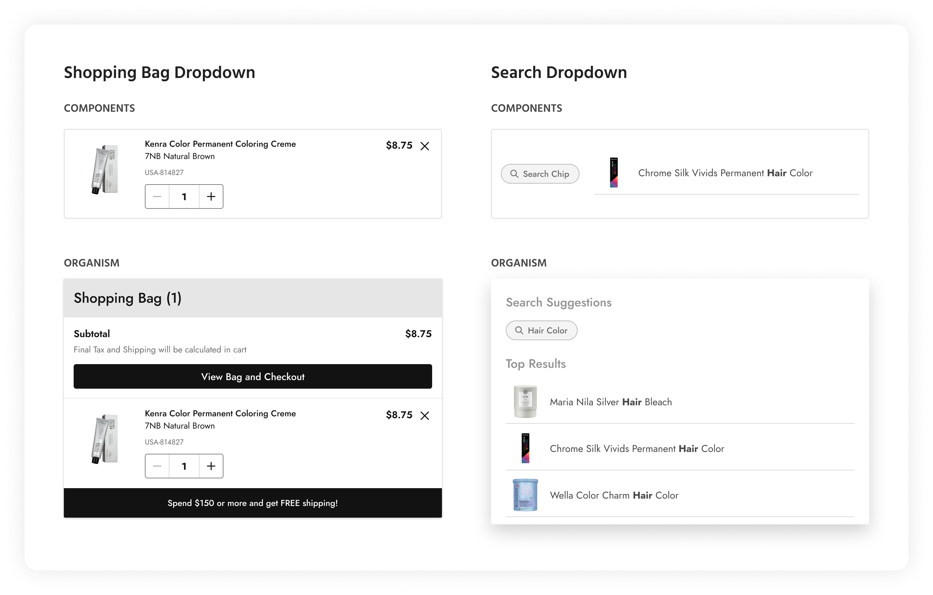
07. Shopping Bag & Search Dropdowns
This shopping bag dropdown provides users with a convenient way to view and manage items in their shopping cart. It appears as a dropdown panel that displays a summary of the items currently in the user’s shopping bag, along with options for reviewing, editing, or proceeding to checkout. The search dropdown shows search suggestions in the form of chips and also keyword suggestions along with the associated product. This allows users to quickly narrow down the result they are looking for.
Templates
Templates serve as predefined layouts or structures that provide a consistent foundation for designing and building user interfaces. They offer reusable frameworks for organizing content, arranging components, and defining the overall visual hierarchy of a page or screen. All the organisms and molecules showcased so far have been assembled into the following template examples shown below.
01. ‘My Account’ Template
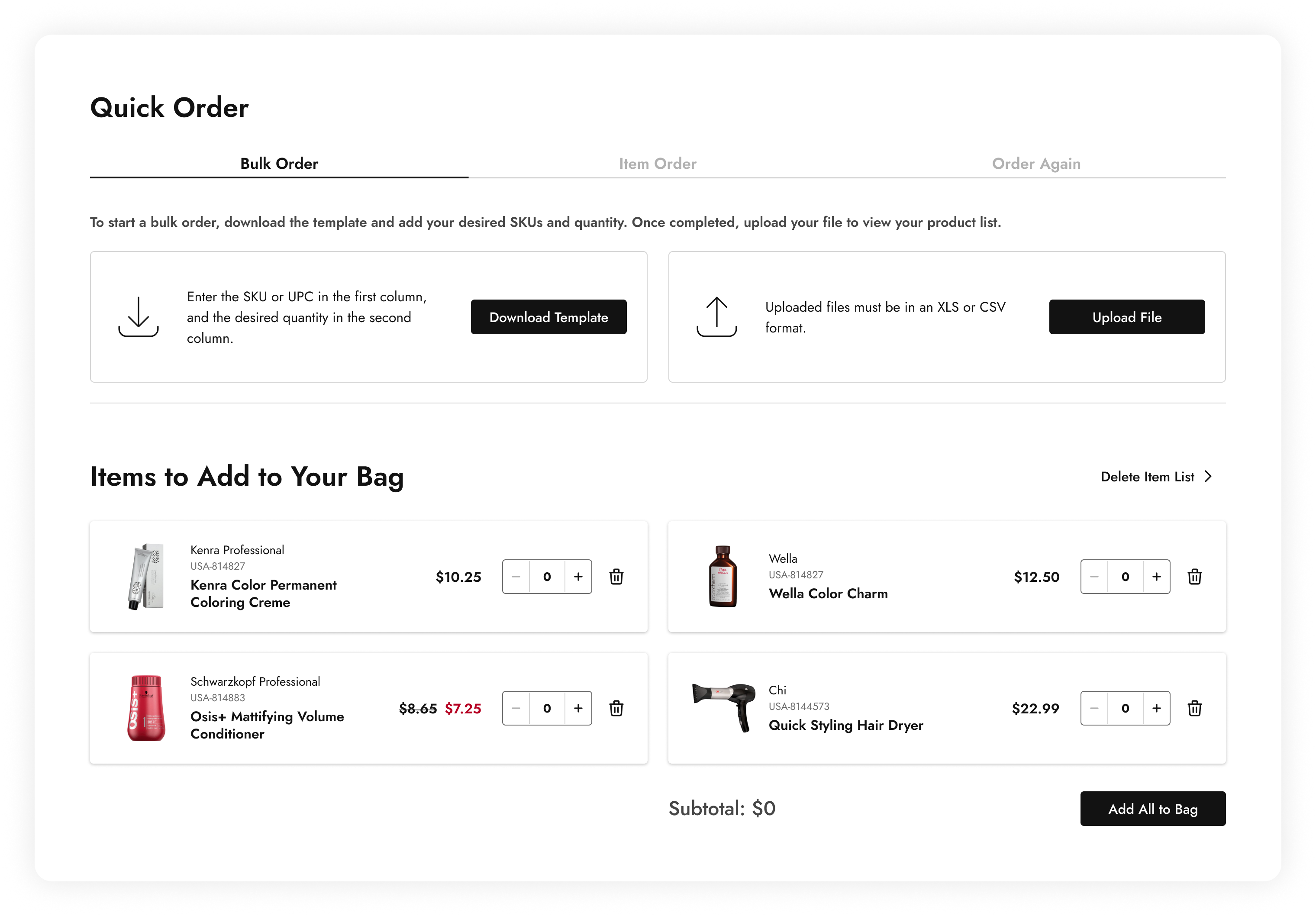
02. ‘Quick Order’ Template
03. Product Detail Template

Pages
Finally, taking all the molecules, organisms, and templates put together, pages were created to represent entire screens or views within this product. These pages serve as standardized frameworks for organizing content, structuring user interactions, and defining the overall user experience. Instead of showing screenshots of the individual pages, it seemed more pertinent to show an interactive prototype comprising of all the components put together in the design system.
Component Preview
This video gives a preview of the functionalities available to a user when incorporating the ‘Quick View’ template component into a design.
Every property, starting from the image of the product, the name of the brand and product, down to the swatch thumbnails are all editable in the properties panel.
Although not included in this portfolio page, every component in this design system is responsive and has desktop, tablet, and mobile variants.
Project Outcome
Business Outcome:
Customers were highly satisfied with the design upgrades of the website, so much so, they encouraged their franchisees to use the website rather than call into customer service to place orders.
Implementing the design for the shipping tiles saw an immediate boost in sales for same day delivery, as much as 52% in one day, and BOPIS came in 19% higher than the daily average.
Personal Takeaways:
As a mentor on this project, I recognized the importance of teamwork and consistent feedback. I successfully trained my mentees in using auto layout in Figma through design workshops, demonstrating how components connect from the atom stage to the final template, emphasizing consistency and scalability in the design system.
We prioritized accessibility throughout the design process, carefully checking contrast, typography, and navigation issues.
Despite a tight turnaround and limited budget, we ensured timely feedback allowed us to complete all work within the given timeframe.