WABE podcasts are a source of educational, informative, entertaining, and reflective content. They are representative of Atlantan culture, and are a voice for passionate storytellers who seek to engage a wide range of audiences not just locally, but nationally.
The following sections feature podcast artwork done by me alone and some collaborative projects done with other artists. Each artwork is reflective of the tone and style of the podcast content it represents.
CLIENT
WABE
YEAR
2016–2020
ROLE
• Brand Identity
• Logo Design
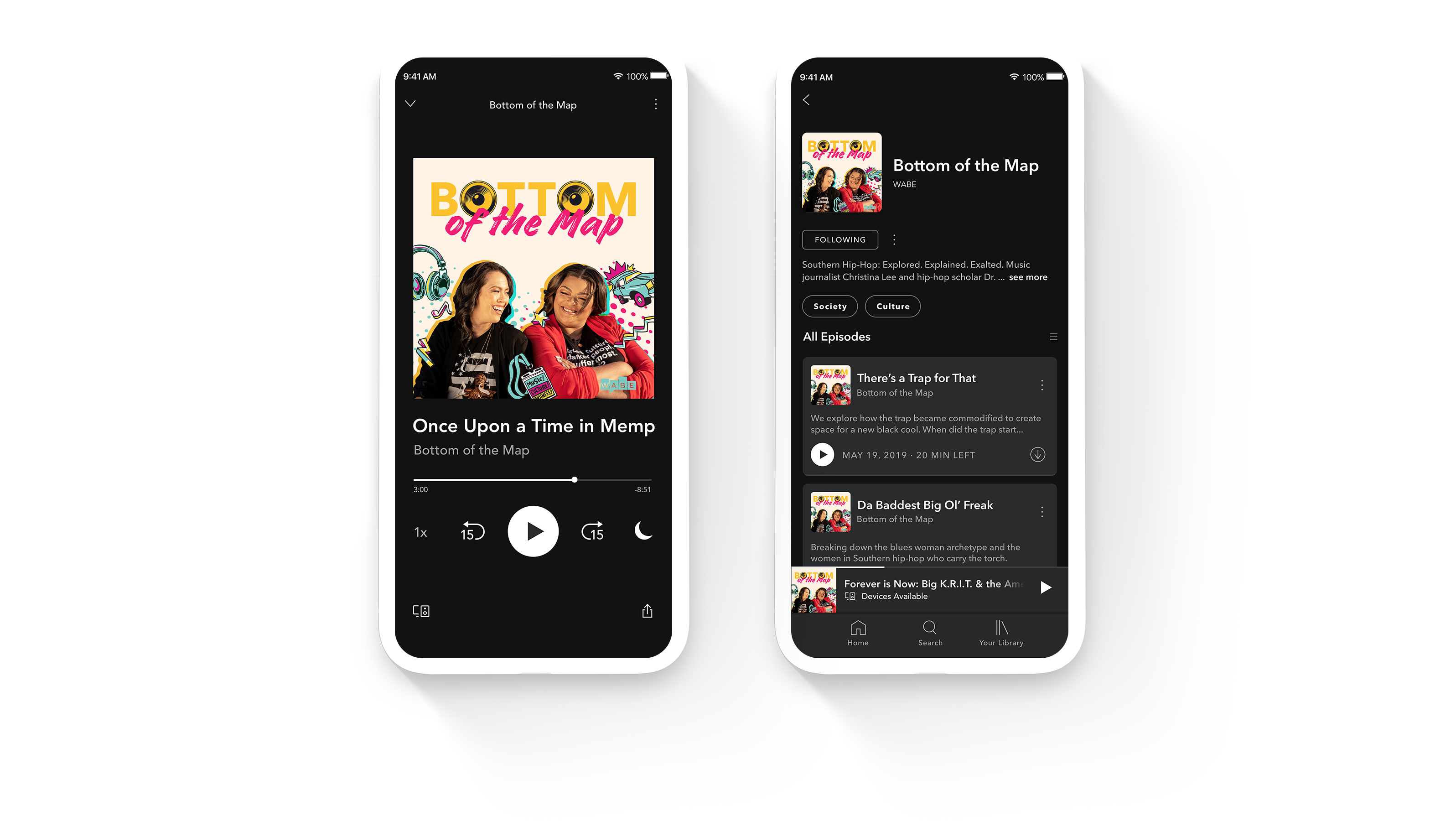
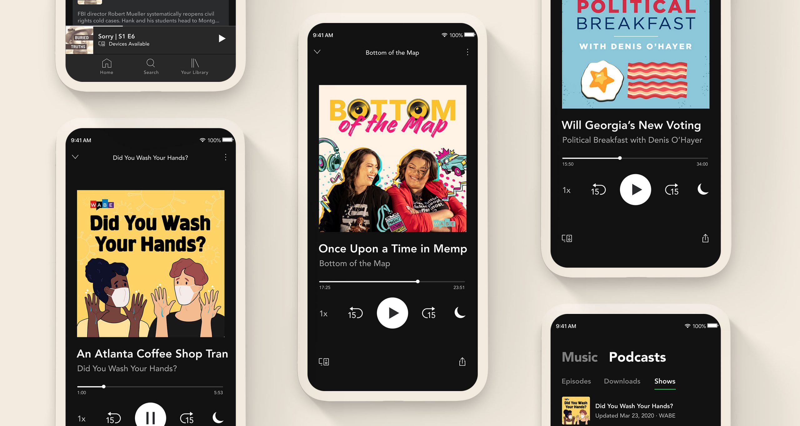
ABOUT BOTTOM OF THE MAP
This podcast is centered around Southern Hip-Hop culture and explores the explosion and impact of said culture on the world. The overall look and feel of the logo was to convey sassy, passionate, authentic, and energetic conversation, hosted by two expert hip-hop heads, music journalist Christina Lee and hip-hop scholar Dr. Regina N. Bradley.
THE WORK
Since the conversation is being led by two women who provide great insight into the southern hip-hop scene, it was inarguable to feature the hosts front and center. The logotype had to be unique enough to stand on its own in any space and called for the use of bright and vibrant colors. Conveying excitement and energy depended not only on the quality of photography, but also including fun and playful elements of illustration and graffiti.
Season 1
The creative inspiration behind the artwork for the first season was mostly street art and graffiti featured in some of Atlanta’s most iconic locations. The graffiti aspect formed the background for the hosts to give it a hip-hop feel. The photography was done by Jonathan Kelso, an Atlanta based editorial photographer, which captured the vibrant energy the hosts bring to the podcast.
Season 2
The art for the second season was still in keeping with the vibrant and colorful hip-hop theme, alluding to elements like the “trap-car”, headphones, musical notes and a music fest badge. The illustrations done by artist India Nabarro are reminiscent of the graffiti component used in the first season, but give this season a more unique and personal style. My design role in this project was to harmoniously combine the elements of illustration and photography to effectively convey that same energy and authenticity within a single frame.
Here are examples of some social media posts that were designed for various purposes; for instance, audiogram attachments of the hosts giving some tidbits of an episode, promotion for their panel at the SXSW fest, or reviews from listeners.


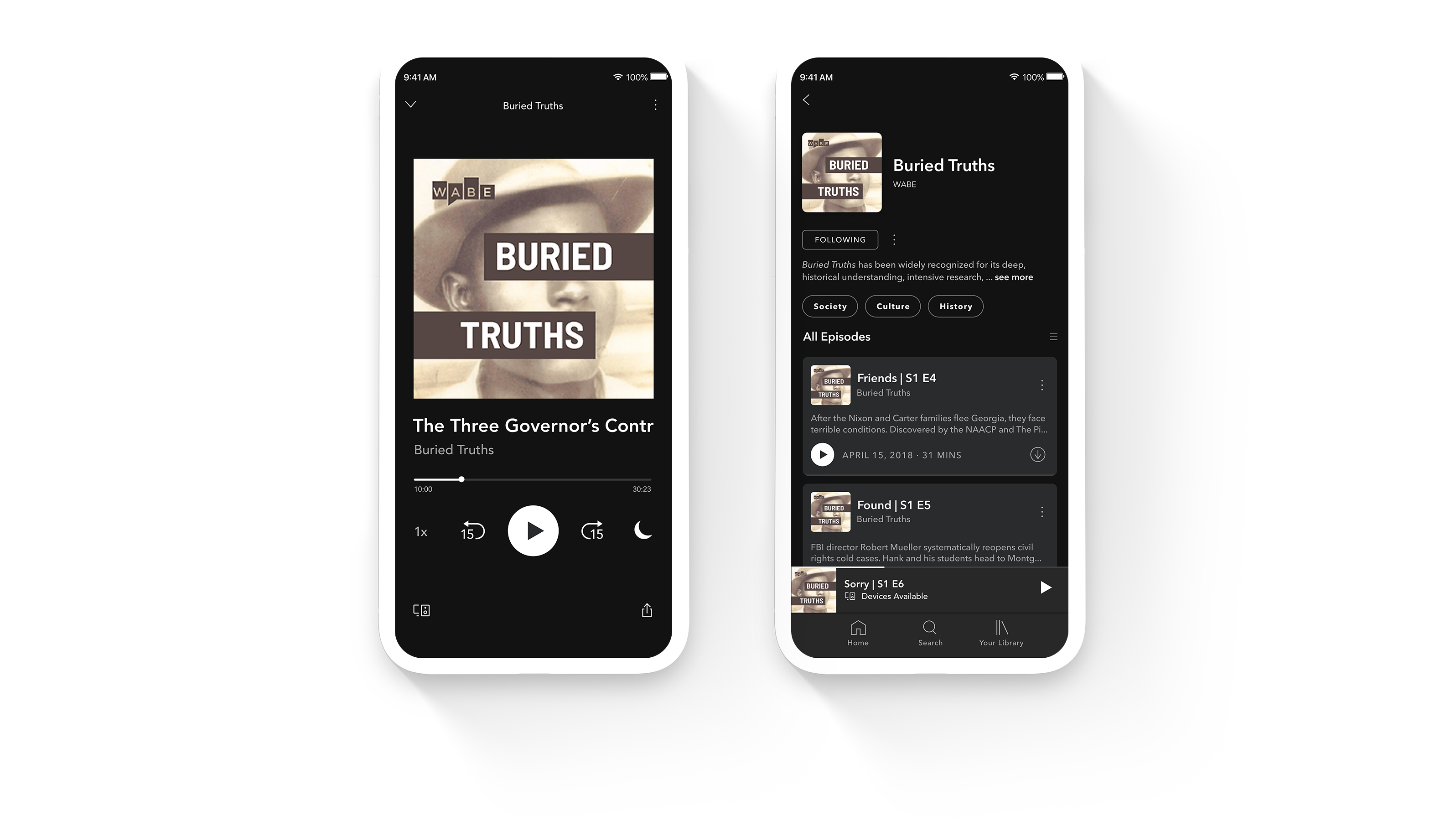
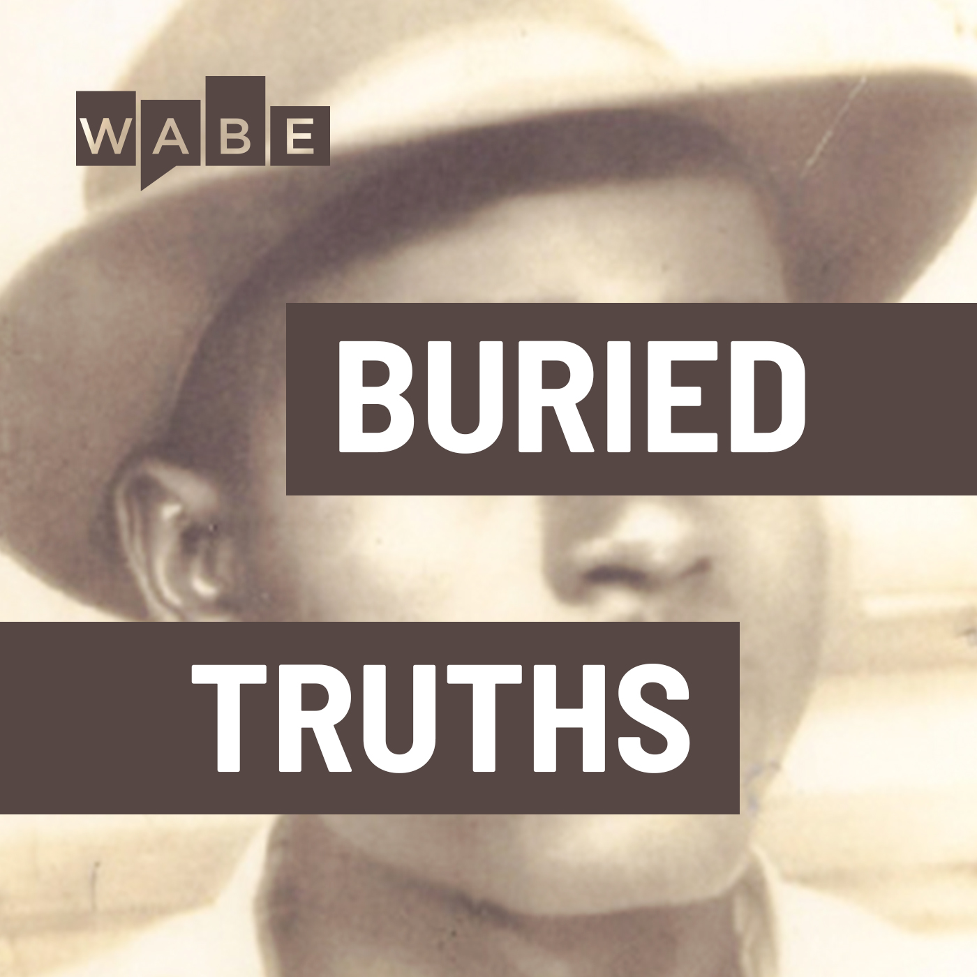
ABOUT BURIED TRUTHS
While this podcast has the air of the “true-crime” genre, there is more of a historical and social aspect to it. The challenge of this project was to come up with artwork that did not look like a cold-case mystery thriller. The overall tone had to have more of a historical look and feel, while at the same time preserving a sense of mystery to draw listeners in.
THE WORK
Buried Truths is a rediscovery, reexamination, and unearthing of facts and history behind the case of Isaiah Nixon’s murder, a man who was robbed of his life because he dared to vote. The use of his image, therefore, formed an integral part of the artwork. Given that his case was summarily dismissed, closed and lay forgotten until recently was something that had to be conveyed. The bands over his eyes and mouth signify how unjustly and ruthlessly he was silenced but, at the same time, the words in the bands communicate he’s not done telling his story yet.
Design Exploration
Before settling on the name Buried Truths there were other working titles, each of which underwent several design explorations. Some of these names were Cold Case Justice, Justice Denied, Restless History, Revisited, and Unsolved and Unpunished. However, none of these titles were fitting enough for the subject matter at hand which channeled a combination of “true-crime” and history.
Final Artwork
Initially, all the artwork explorations involved usage of vague, abstract or very generic mystery-crime-thriller imagery, not quite pinpointing the subject matter. However, once the topic and story were solidified, the rendition of the artwork became clearer. The first season is centered around Isaiah Nixon, hence it made sense to use his image. But the bars kept his identity a mystery, while at the same time conveying the topic of suppression explored in this podcast.
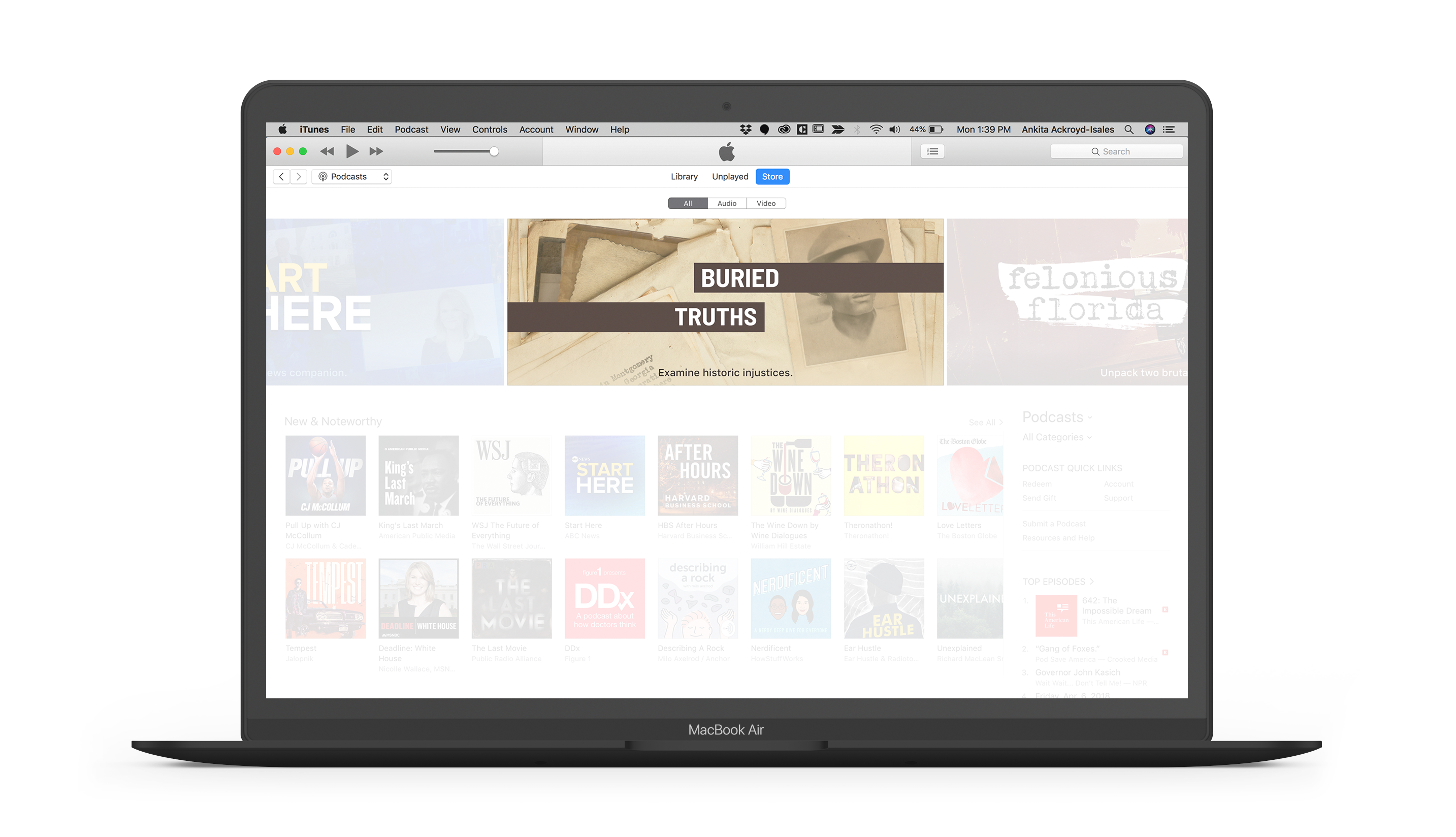
Buried Truths was featured on iTunes as a new and noteworthy podcast
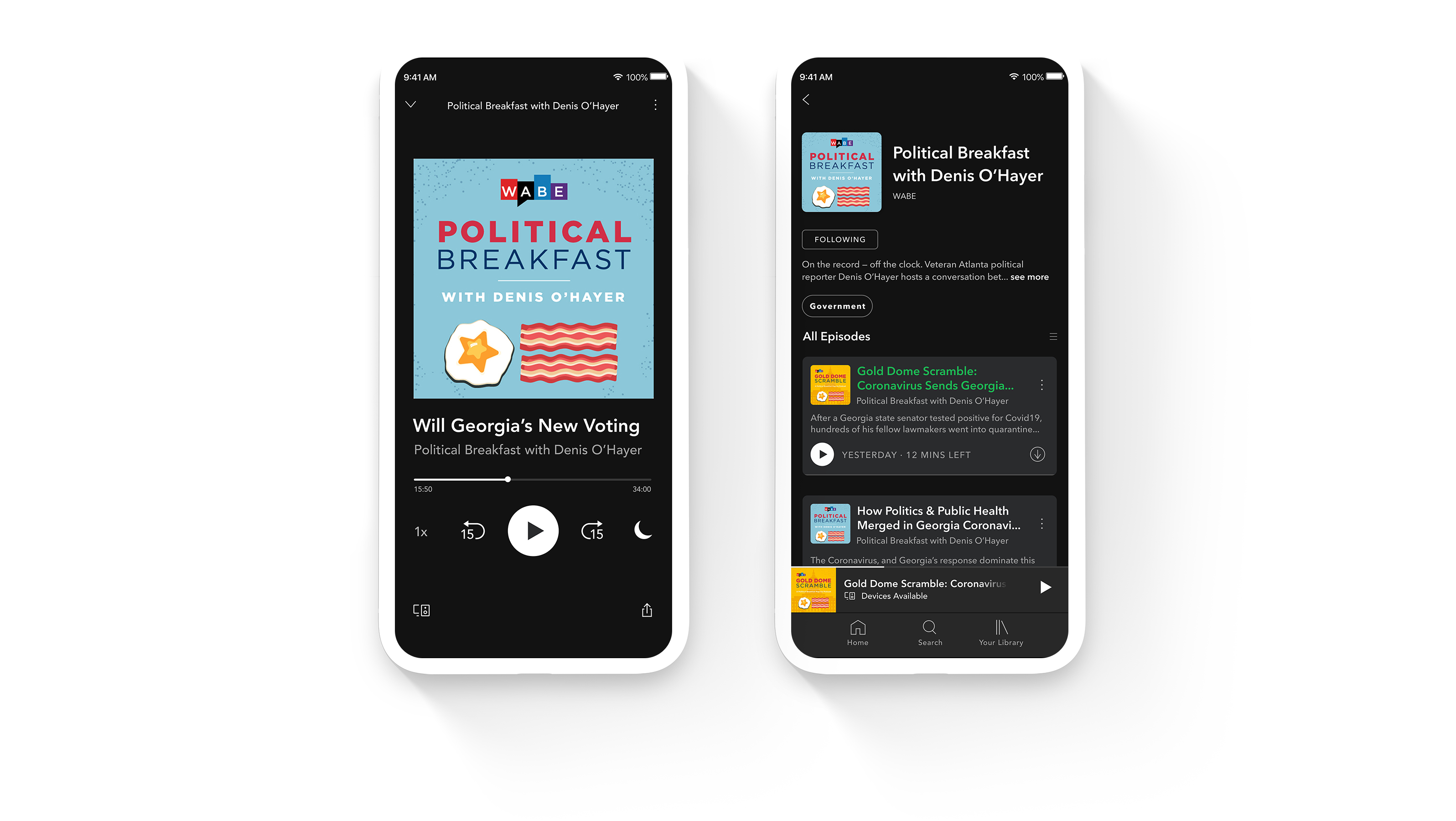
ABOUT POLITICAL BREAKFAST
Political Breakfast is a conversation between strategists from both sides of the aisle, hosted by veteran Atlanta political reporter Denis O’Hayer. This podcast is a respectful, informative, and lively discussion where the strategists bring issues to the table which are otherwise avoided, and give credit where it’s due. The overall tone of the podcast is not meant to be overly serious, but a stimulating and refreshing take on political issues, views and opinions.
THE WORK
The tone of this podcast is lively and jovial. The design was to steer clear of typical political grimness. The challenge was to reimagine the political theme in a more lighthearted and witty context, given that the conversation between the strategists is an animated and friendly banter.
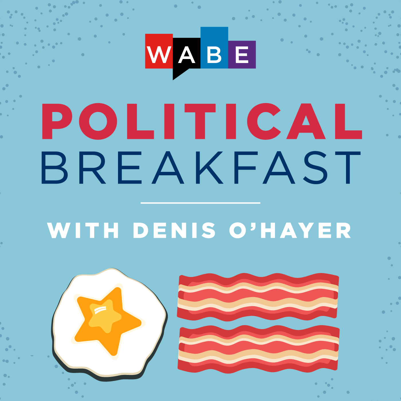
Political Breakfast
Since this is a podcast which deals with American political issues, the red-white-and-blue theme were worked into the typography of the artwork. The “stars and stripes” were given a humorous breakfast themed twist with the eggs and bacon, an all-American breakfast representing elements of the American flag.
Gold Dome Scramble
Gold Dome Scramble is a Political Breakfast pop-up podcast in which host Lisa Rayam delivers clarity about how the state legislative process works. Since this podcast is a spin-off, the original concept of the eggs and bacon with the red-white-and-blue typography were retained. However, since this is a Georgia legislature specific podcast, it made sense to figure in a silhouette of the Georgia Capitol or the “gold dome”.
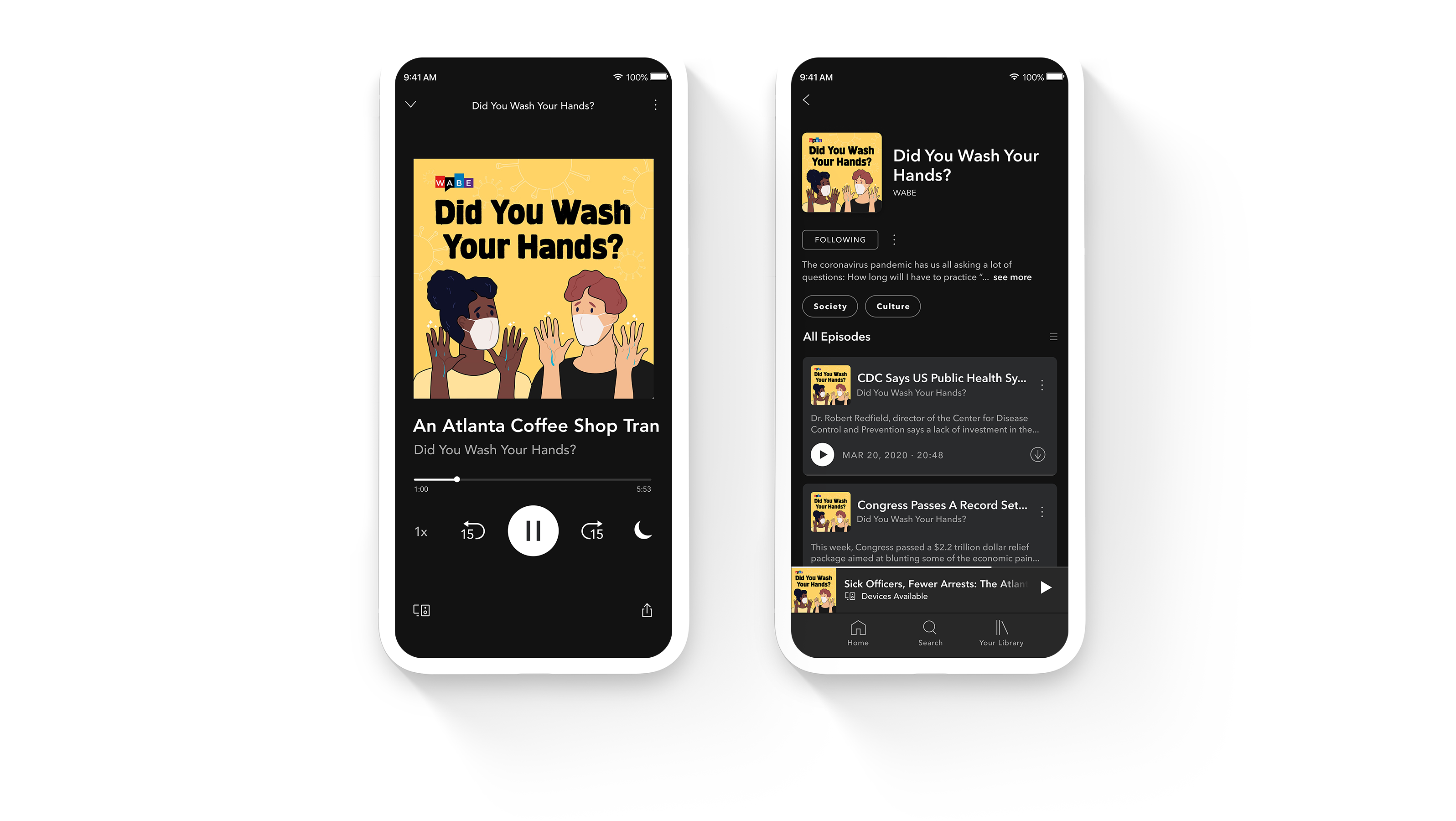
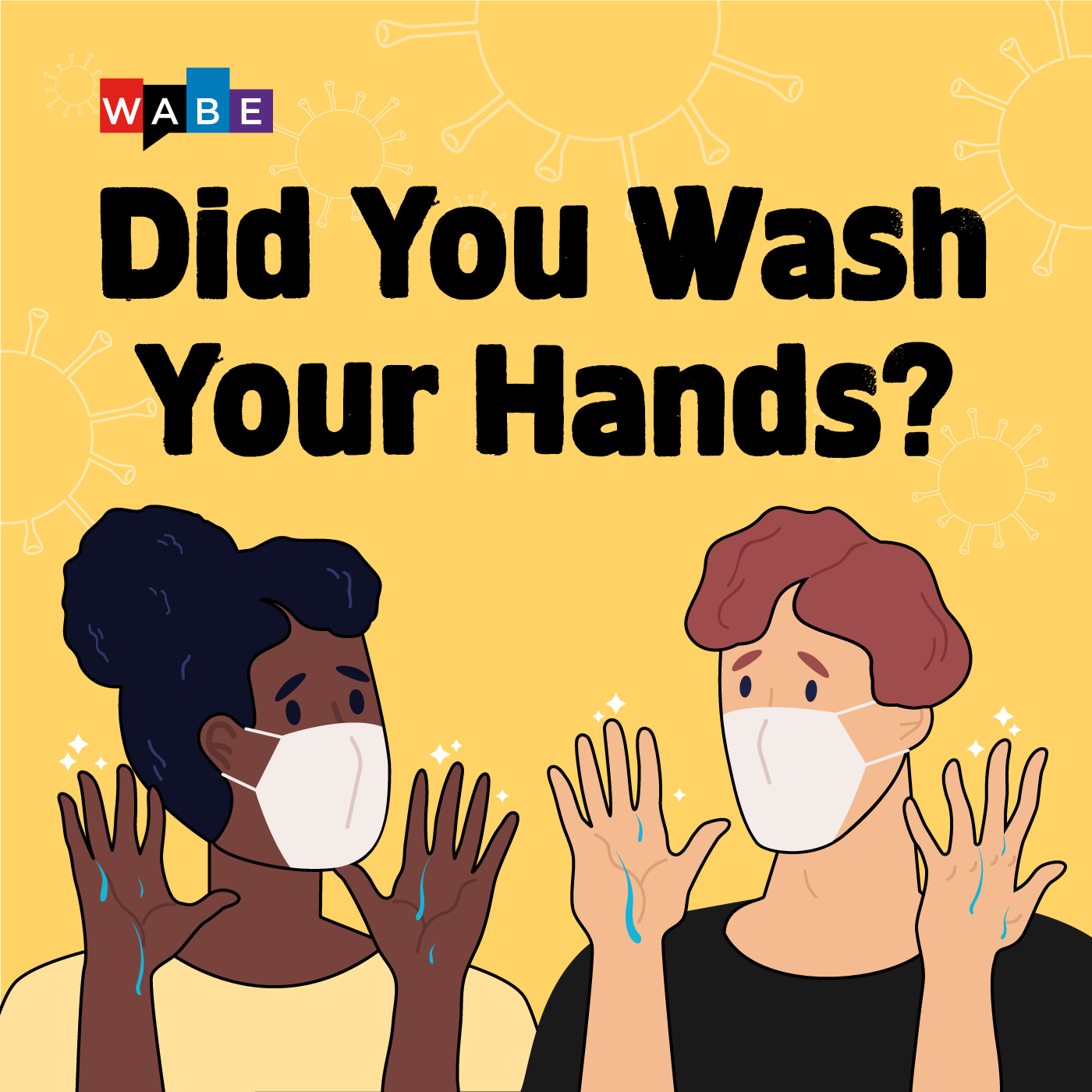
ABOUT DID YOU WASH YOUR HANDS?
In light of the Coronavirus pandemic, WABE produced the Did You Wash Your Hands? podcast to create awareness and answer questions related to COVID-19. While audiences are already dealing with a lot of grief and despair in the news on a daily basis, the general consensus was to not make this subject more gloomy of an experience. The aim of this podcast is to update audiences with practical information and provide insight on how to combat the new norm in place due to the virus.
THE WORK
The challenge was to come up with a design that steered clear of the cliched stock imagery of the COVID-19 virus, and to also not create something that evoked gloom and despair. Taking into account the whole aspect of regularly washing our hands and wearing protective gear to prevent the spread of the virus, the best solution was to create an illustration which would not only tackle the problem of dreariness, but also represent a lighter take on the circumstances in place.
The Artwork
Given the main concern of constantly observing personal hygiene and worries about the virus being airborne, the artwork of two people donning face-masks and wearing apprehensive expressions with freshly washed hands exhibit the fears of people all over the world. An illustration seemed liked the right counterbalance to tackle a topic so heavy.