This experiment in typography was to take all the text off of the canned food label “Chef Boyardee’s Spaghetti and Meatballs” and do an exploration of typographic studies. This is a useful exercise in typography as the grid system is explored in several ways, mainly making use of quadrants on a page. This study not only revealed the usefulness of sticking to the harmony of the grid system, but also experiments with how ‘chaos’ can be introduced to its order and conformity.
YEAR
2014
ROLE
• Typography
• Graphic Design
• Print Design
THE CHALLENGE
The overall concept of this project was to explore different type studies of the typographic elements on the food label. It also explored how text can be integrated with visual elements to create interesting and dynamic imagery. This type study was explored within the dimensions of a 7.5” square, with 6 quadrant regions.
THE WORK
One of the goals was to begin the exploration using a sans serif typeface only in one weight and size. As the exploration expanded into further complicated steps, the weight, size and placement became more experimental. The sans serif typeface that was chosen was Univers in a weight of 55, since it is a neutral typeface and does not overpower the overall visual aesthetics. As the type study expanded further, use of other the typefaces such as Tungsten and Stymie were explored in conjunction with other visual elements like illustrations and photography.
Six Quadrants
The page is divided into three main quadrants — top, middle, and bottom — and those are further divided into left, right, and center quadrants, depending how the content is distributed around the page.
Center
Top
Bottom
Phases 1 to 4
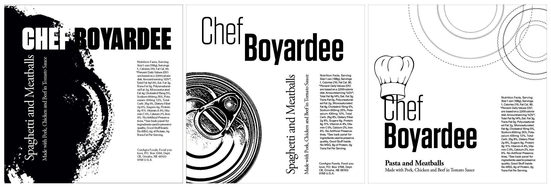
Phase 1
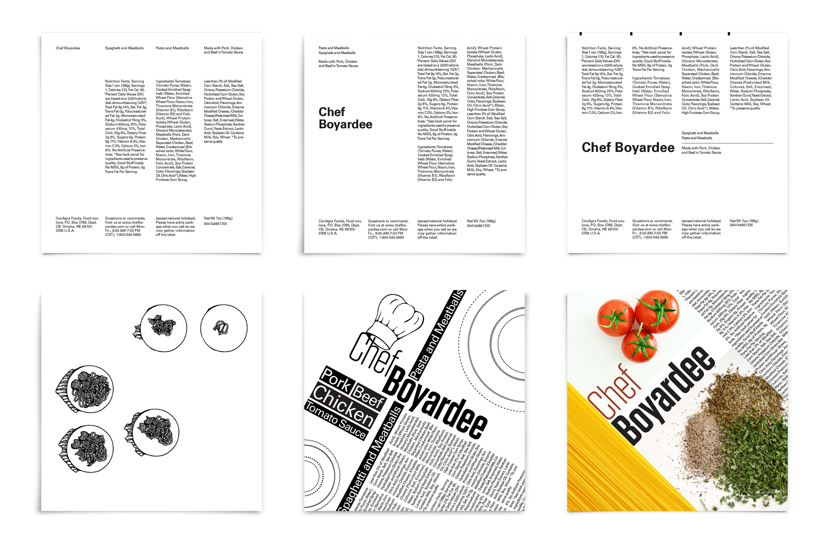
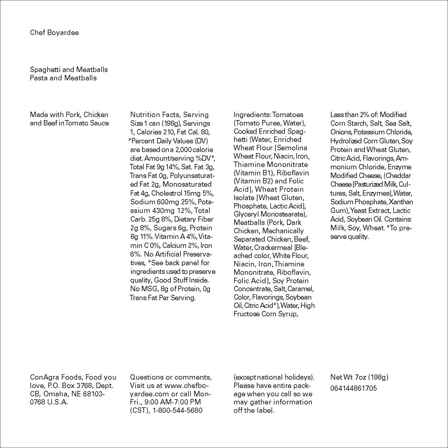
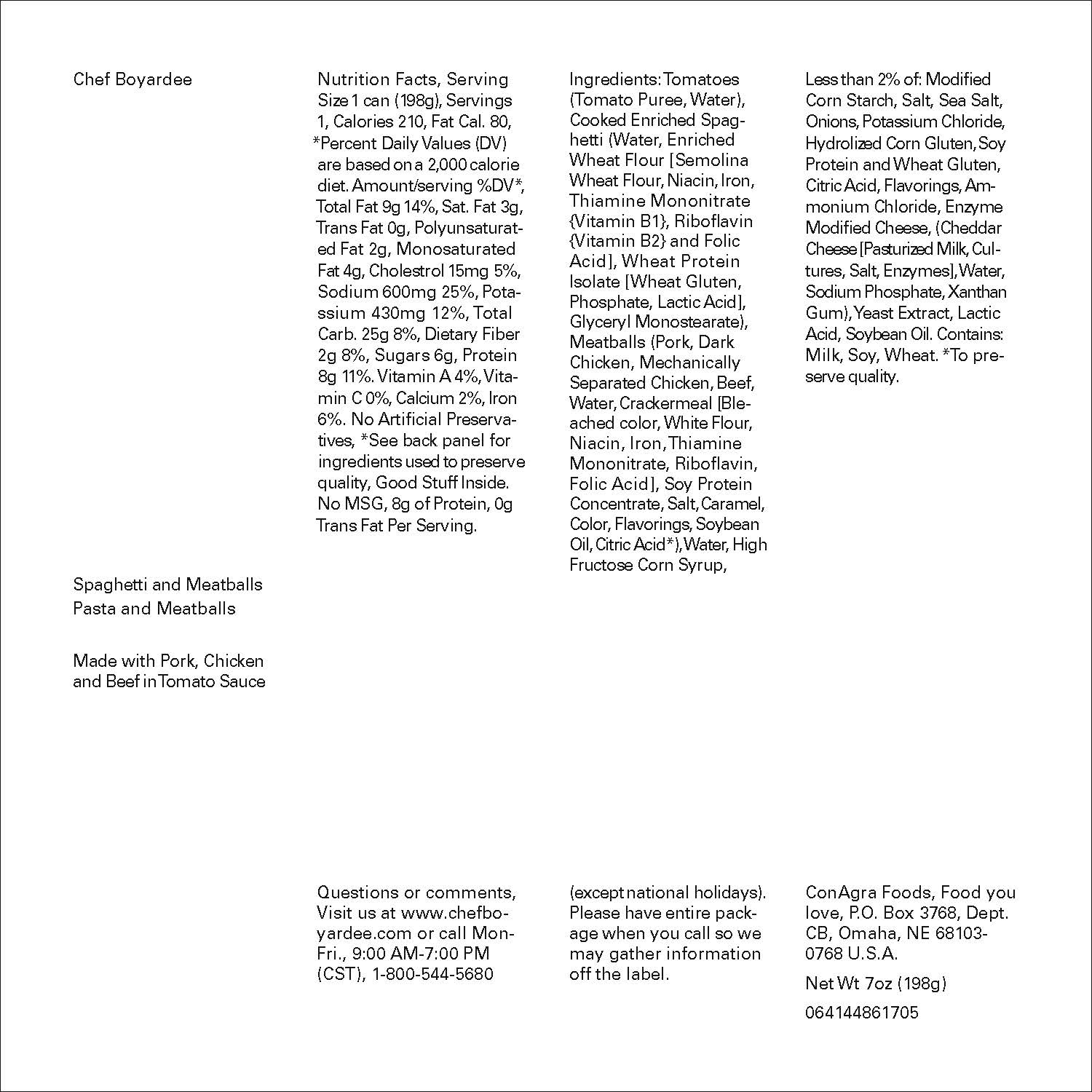
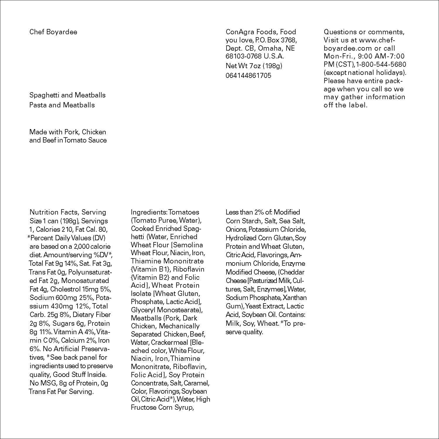
The first phase was taking all the text from the label and dividing them up into columns of one, two, three, and four. There is no typographical hierarchy in terms of weight or size, but the use of the grid and white space determines the direction in which the eye travels, thereby establishing a hierarchy. The point of Phase 1 was to figure out in how many different ways the content could be arranged within the six quadrants.


Phase 2
Phase 2 was the first instance of using only one typographic element in a heavy weight and a bigger type size, in this case the name of the brand “Chef Boyardee”. It also continues to explore the use of the six quadrants and four types of columns.


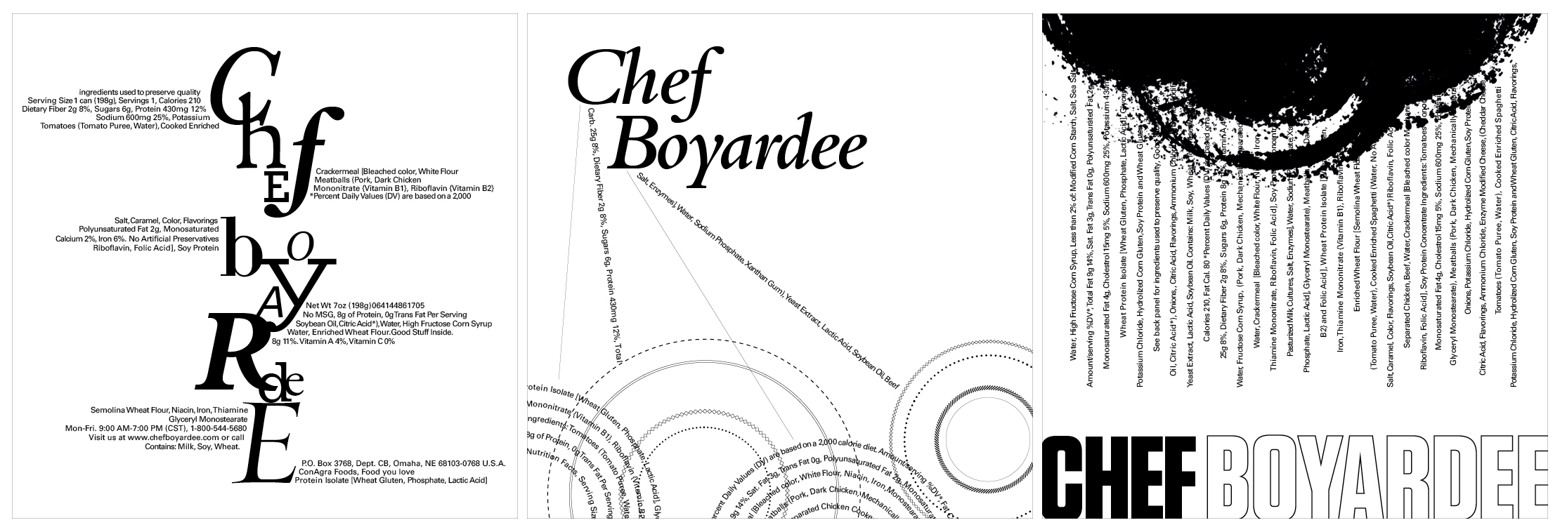
Phase 3
With Phase 3, there was an introduction of decorative elements which were geometrical and brush stroke lines. The goal behind using lines was to not just make the layouts visually more interesting, but also direct eye movement across the page. The lines vary in stroke, length, and style.


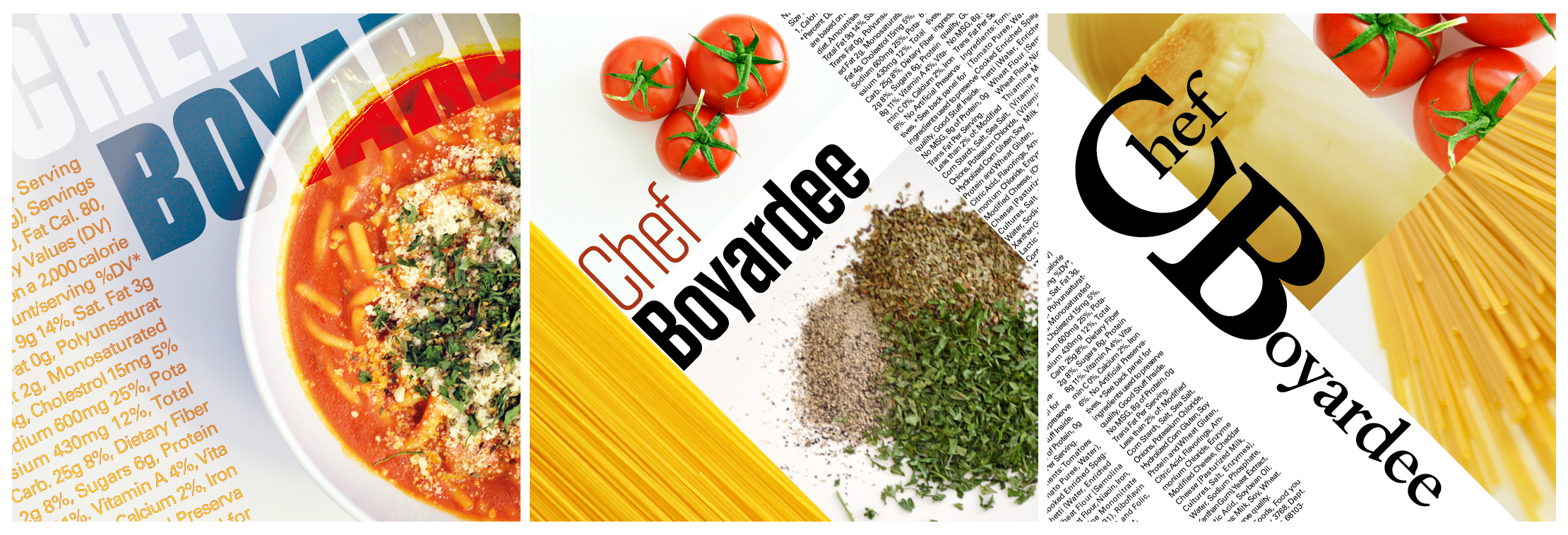
Phase 4
This phase was more visually experimental, showing how the hierarchy of typography moves across the page. The hierarchy has been communicated through visual cues of how big or small some elements are like the balls of spaghetti and the chef hats, or quantitatively such as the amount of pasta on the plates. The section first shows the typographical columns, then the numbers indicate the hierarchy, and finally, the visual rendition represents the quadrants.


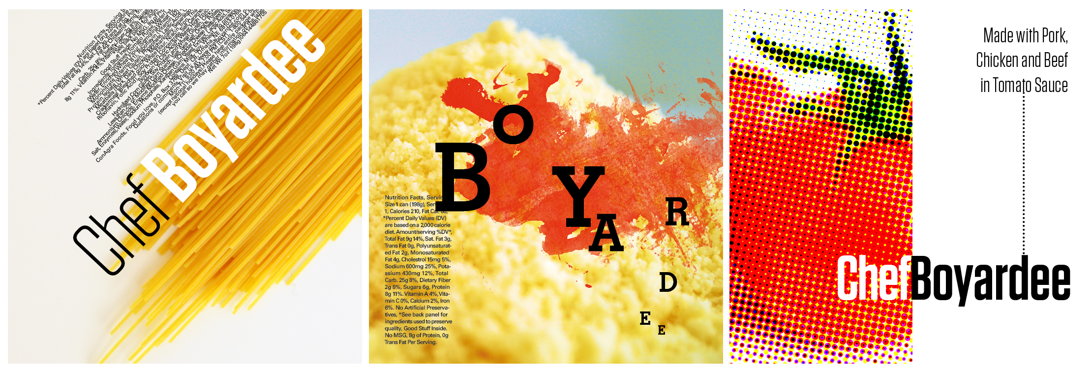
Phases 5 & 6
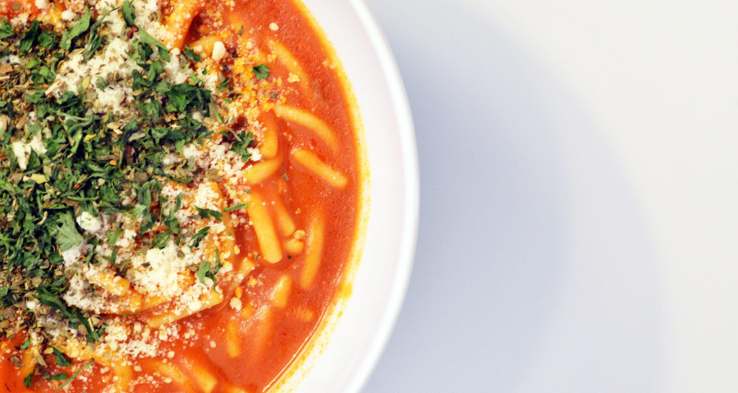
The last two phases are the most visually experimental, as they break the grid, but still manage to make use of it as there’s order within the chaos. Phase 5 worked with the colors black and white only. Phase 6 incorporated full colors. The images used in the project were all personally photographed. These pictures are of tomatoes, onions, cheese, spices, spaghetti noodles, and the Chef Boyardee product itself.